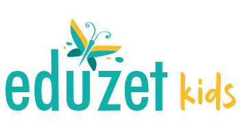
We design PREMIUM Logos which you can Trademark © ® ™
Logo designer, Logo Company, Logo Maker
Every Logo / Client / Brand / Business is Unique!
So are our IDEAS, Please scroll down to view our Logo Portfolio


Logo Client
Oyekitchen.com
Chennai, India


Director / Owner Info
Mr. Vijay Dutt


Logo Work Done
Logo Design

Logo Industry
E-Commerce Store, dot com, online kitchen appliance store.

Client Brief - "We are an e-commerce company selling kitchen ware products to consumers. We focus on different product lines which includes Steel range, metal range, crockery range, Plastic range and Kitchen appliances. We offer a wide variety of selection ranging from thousands of products."


Logo Creative Concept
The idea was to have a catchy name that our target audience can easily remember. The client wanted the brand name going forward. As the client has choose a name that is Smart, Global Desi, Fun filled; we took the same approach with the logo also, so it dose'nt get mixed-up and lost with thousands of e-commerce websites with stereotype image 'name with shopping carts.

The logo typography and symbol is SYNC together, it symbolizes the meaning of Company dot com name perfectly 'OyeKitchen', the mouth representing the taste buds, food, brand voice and the announcement, that its OyeKitchen.

Logo Makers, top Logo designers, Logo Design Company india, creative Logo designers, creative Logo Artist


Logo Makers, top Logo designers, Logo Design Company india, creative Logo designers, creative Logo Artist

Logo Makers, top Logo designers, Logo Design Company india, creative Logo designers, creative Logo Artist

Logo Client
E-Pansari
New Delhi, India


Director / Owner Info
Mr. Parul Bhatia


Logo Work Done
Branding, Logo Design


Logo Concept
In this astrologically influenced logo featuring a cart of essential groceries against a green backdrop, the color green is aligned with the astrological sign of Taurus.

Taurus is associated with practicality and abundance, making it an ideal choice for a logo representing a cart filled with useful items.

The combination of green and the depiction of practical essentials signifies a grounded and prosperous offering, harmonizing with Taurus' attributes of stability and practical abundance.

This logo subtly connects astrology with the everyday essentials offered by your brand.

Logo Industry
Online Grocery Portal

Logo Maker chandigarh, Logo designer chandigarh, Logo Design Company chandigarh, Logo Design chandigarh, Logo Artist chandigarh, Logo designer chandigarh

Logo Client
Shopping
Kopaganj, Disst-Mau, India


Director / Owner Info
Mr. Shahnwaz Ahmad


Logo Work Done
Logo Design


Logo Concept
The logo has created as per Vastu principles , made with spectrum of multiple colors. The varied hues symbolize balance and positivity. Positioned at the right upper corner are four plus signs, signifying abundance and prosperity.


The placement of these symbols adheres to Vastu guidelines, invoking positive energies.


The logo captures the essence of a vibrant and balanced brand, integrates the principles of prosperity and positivity according to Vastu, creating a visually appealing and energetically aligned representation for your brand


Logo Industry
Multi Level Marketing, Outlets

Logo Maker chandigarh, Logo designer chandigarh, Logo Design Company chandigarh, Logo Design chandigarh, Logo Artist chandigarh, Logo designer chandigarh

Logo Maker chandigarh, Logo designer chandigarh, Logo Design Company chandigarh, Logo Design chandigarh, Logo Artist chandigarh, Logo designer chandigarh

Logo Client
100 Business Ideas


Director / Owner Info
IMedia Ad Agency


Logo Work Done
Logo Design


Logo Concept

In crafting a business platform logo infused with Vastu principles, the design begins with the prominent placement of the number 100 on the left side, symbolizing abundance and completeness.

The choice of blue and dark blue is often visually appealing and creates a sense of depth and sophistication.

Numerologically, the numbers 1 and 0 are strategically integrated, representing new beginnings and infinite possibilities, respectively.

Flowing lines connect the number 100 to other logo elements, symbolizing the continuous and harmonious flow of positive energy and opportunities within the business platform.

Symbolic Vastu imagery, such as stylized swastikas or conch shells, subtly reinforces positive vibrations and auspiciousness.

Open spaces within the design allow energy to circulate freely, promoting an atmosphere of openness and receptivity to new ventures.

The logo is thoughtfully aligned in accordance with Vastu directions, positioning the number 100 towards the north or east for prosperity


Logo Industry
Business Consultancy & Blogging Website

Logo Maker Haldwani, Logo designer Haldwani, Logo Design Company Haldwani, Logo Design Haldwani, Logo Artist Haldwani

Logo Maker Haldwani, Logo designer Haldwani, Logo Design Company Haldwani, Logo Design Haldwani, Logo Artist Haldwani

Logo Client
Eduzet


Director / Owner Info
Eduzet


Logo creative Concept
The logo for our education-focused brand is a harmonious blend of simplicity and symbolism. The clean and modern company name is accompanied by a butterfly icon in matt green and yellow, symbolizing transformation and growth in learning.


The butterfly's wings subtly evoke open pages, emphasizing education's joy and freedom. The chosen colors create a positive and welcoming vibe, making the logo versatile for various educational materials.


This design encapsulates our commitment to providing a transformative and enriching educational experience, standing out with its minimalist yet impactful visual appeal.


Logo Work Done
Logo Design, Stationary Design

Logo Industry
Education

Logo Makers, top Logo designers, Logo Design Company india, creative Logo designers, creative Logo Artist

Logo Client
Kmall.in
Bangalore, India


Director / Owner Info
Mr. Suresh Jain


Logo Creaticve Concept
The logo is a vibrant blend of multiple colors, expressing diversity and dynamism. At its core is the abstract representation of pillars forming the letter 'K' in a 3D style.


The pillars symbolize strength, stability, and growth, reflecting the foundational values of the company. The array of colors signifies the diversity and range of services, capturing the brand's multifaceted nature.


This design is a bold and modern representation, showcasing the company's commitment to a colorful and robust presence in its industry


Logo Work Done
Branding & Logo Design

Logo Industry
Online Shopping portal

Logo Client
Fun Drones

Director / Owner Info
Alexander JM


Logo Work Done
Logo Design & Stationary Design


Logo Concept
In this theme based logo the drone features a playful face, imbuing the design with a sense of joy and personality.
The vibrant red and black palette reflects both the freedom of flight and the cutting-edge technology of drones.
The central focus is on a sleek and dynamic representation of a drone in flight.
The drone's dynamic mid-flight pose communicates agility and movement, while the cheerful face adds a whimsical touch.
The modern font ensures clarity, and the tagline "Elevating Perspectives, Inspiring Innovation" captures the essence of the brand's mission


Logo Industry
Drones

Fashion logo design, Online eCommerces Store Logo designers, Logo Design Dehradun, Logo Artist Dehradun
 

Logo Client
Privy Shop
Bangalore, India


Director / Owner Info
Mr. Ravikanth


Logo Concept
In this text based logo, envision a sleek and sophisticated design with a black background. The brand name, displays in a palette of pink, light blue, and white fonts, radiates modernity.

Notably, the 'O' in the brand name is ingeniously replaced by a lock icon, symbolizing security and trust. The contrast of colors against the black backdrop ensures visibility and adds vibrancy, making the logo memorable.


Logo Work Done
Logo Design

Logo Industry
Fashion, Online E-Commerce Store

Jwellery brand logo designs, Gemstone logo makers, Astro & Vaastu Consultants company logo artist

Logo Client
Furniture Park
New Delhi, India


Director / Owner Info
Mr. Mukesh Vaswani


Logo Concept
Embodying Vastu and astrological energies, our logo features a chair shape symbolizing stability and support, evoking a grounded foundation for success.

The black and green font signifies the harmonious flow of energy and growth, promoting prosperity. The red dot positioned atop the 'I' acts as a powerful sun symbol, representing energy, vitality, and leadership.

This focal point highlights the brand's individuality and dynamism, creating a logo that not only visually resonates but also aligns with positive astrological influences for a prosperous and balanced presence.


Logo Work Done
Logo


Logo Industry
Office Furniture, Furniture Brand

No 1 Logo Makers, Logo designers, Logo Design, creative Logo Artist

No 1 Logo Makers, Logo designers, Logo Design, creative Logo Artist

Logo Client
Maplecart
Hyderabad, India


Director / Owner Info
Mr. Gopi Krishna


Logo Creaticve Concept
This logo is a visual representation of strength, growth, and dynamism in the e-commerce sector. Three simple pillars, resembling buildings, stand tall and firm, symbolizing the company's robust foundation.


Each pillar incorporates a tire at its base, subtly portraying the agility and speed associated with e-commerce. The use of multiple colors adds vibrancy, representing the diverse range of products or services offered.


This design signifies a strong and dynamic presence in the online marketplace, capturing the essence of reliability and swift delivery in a colorful and impactful way.


Logo Work Done
Logo Design

Logo Industry
Ecommerce site

Jwellery brand logo designs, Gemstone logo makers, Astro & Vaastu Consultants company logo artist

Logo Client
Hello Ecart
India


Director / Owner Info
Shambu


Logo Concept
The themed logo Concept for HelloEkart encapsulates a profound sense of national pride and optimism. At its core is the contour of the Indian map, symbolizing the diverse heritage of the nation and company is showcasing their reach all over the India. Plans releasing like flaps into the sky signify the unfolding of ideas and progress.

In each corner, circles in the colors of the Indian flag proudly declare 'I Love My India,' fostering a connection between the brand and a sense of patriotic spirit. The brand name, HelloEkart, is dynamically integrated with multicolored letters, mirroring the vibrancy and diversity of India.


Logo Work Done
Flyer

Logo Industry
Online Portal

Logo Maker, Logo designer, Logo Design Company, Logo Design, Logo Artist

Logo Client
Pay Melon
Mumbai, India

Director / Owner Info
Mr. G S Sassane


Logo Concept
This logo Concept embodies technological innovation with a vibrant gradient of orange and yellow, symbolizing energy and dynamism. A diverse array of electronic gadgets within the gradient signifies the brand's comprehensive technological range.

The symbolic font adds sophistication and clarity, reflecting a commitment to modern aesthetics and clear communication. Overall, the logo communicates a forward-thinking and versatile brand image, capturing the excitement of electronic innovation.


Logo Work Done
Logo Design

Logo Industry
Online Recharge Portal

Logo Maker Pune, Logo designer Pune, Logo Design Company Pune, Logo Design Pune, Logo Artist Pune

Logo Client
Style Gali
Delhi, India


Director / Owner Info
Mr. Ankur Mittal


Logo Creaticve Concept
The


Logo Work Done
Logo Design

Logo Industry
Fashion, Online E-Commerce Store

Sports Goods, Export Import logo desigers

Logo Client
Hit N Earn


Director / Owner Info
Hit N Earn


Logo Creaticve Concept
The logo features a striking and bold company name in large red font, exuding confidence and attention-grabbing appeal. Within the name, the letter 'i' is cleverly adorned with a star, symbolizing uniqueness and excellence.


The red color signifies passion, energy, and a strong brand presence. This design communicates a bold and memorable identity, with the star adding a touch of distinction to emphasize the company's exceptional qualities.


Logo Work Done
Logo Design

Logo Industry
Hit N Earn

Logo Maker, Logo designer, Logo Design Company, Logo Design, Logo Artist

Logo Client
Rupyaa
Australia


Director / Owner Info
Rupyaa


Logo Concept
In this logo Concept, a tyre shape, intricately constructed from diverse rectangles in various colors, represents a dynamic and multifaceted financial landscape.

The use of italic fonts in the company name adds a touch of forward momentum and modernity, subtly suggesting agility and adaptability. The array of colors within the tiers hints at the variety of financial services and options available, creating a visually engaging and intricate design.

This Concept indirectly conveys the diversity, dynamism, and modernity associated with an online financial platform without explicitly stating its connection.


Logo Work Done
Logo

Logo Industry
Rupyaa.com

Logo Makers, top Logo designers, Logo Design Company india, creative Logo designers, creative Logo Artist

Logo Makers, top Logo designers, Logo Design Company india, creative Logo designers, creative Logo Artist

Logo Client
Amrit Music


Director / Owner Info
Mr. Gagandeep Singh (Saby)


Logo Creaticve Concept
Logo Concept, we envision a design that embodies sophistication and innovation.


The proposed logo, named Showcase Creations, features a stylized magnifying glass to symbolize exploration and discovery.


This magnifying glass is artfully integrated into the letter "O" in "Showcase," adding a touch of creativity to the design.


The color scheme of deep blue and silver is chosen to evoke professionalism and creativity, while a sleek and modern font style is employed for the text "Showcase Creations" to maintain a contemporary aesthetic.


This logo Concept aims to convey a sense of elegance and originality, making it suitable for a showcase event or creative platform.


Logo Work Done
Logo, Stationary & website Design

Logo Industry
Manufacturer and exporter of high quality musical instruments

Logo Client
Campuskool
Delhi, India


Director / Owner Info
Mr. Ratan Kumar Singh


Logo Creaticve Concept

The word "CAMPUS" is emphasized with bold, block lettering in a gradient of warm colors, starting from a deep red and transitioning into a bright orange.


The variance in color may symbolize energy, dynamism, and progression, suggesting innovation or a modern approach to whatever services or products this brand offers.


The second part of the name, "KOOL", follows the same color theme but utilizes a different, more playful and rounded typeface.

This part of the logo contrasts with the seriousness of "CAMPUS", and the stylized 'K' with a 'swoosh' element underneath gives the text a cool and approachable feel.

This suggests that the brand is friendly and accessible, perhaps targeted towards a younger audience such as students.


Above the text, there is a dashed line in a dark gray color, which could represent a road or a path, implying a journey or progress.

The dashed lines could also allude to a digital or technological element, as they resemble a loading or buffering symbol commonly found in digital environments.


The tagline "advance your growth" is positioned underneath "KOOL" and adds to the educational and developmental connotations of the brand.

This phrase is smaller and in plain font, making it less dominant but still integral to the logo's Concept, emphasizing the brand's commitment to growth and advancement.


The magnifying glass icon at the end of the logo complements the theme of education and discovery, suggesting that this brand or company focuses on helping its audience to uncover or delve deeper into subjects of interest, perhaps providing educational tools, resources, or opportunities for exploration and learning.


Logo Work Done
Logo

Logo Industry
Education Portal


Logo Client
PetKart
Mumbai, India


Director / Owner Info
Mr. Vikas Sharma


Logo Concept
In this logo Concept, the company name is transformed into a vibrant and playful representation of various pets. Some letter in the name takes on the shape and personality of different animals, creating a lively and engaging visual impact.


The multicolor scheme adds vibrancy and diversity, reflecting the range of pets available through the online shop.


This Concept aims to convey the joy and variety of pets offered by the online platform without explicitly stating its connection to company.


Logo Work Done
Branding, Logo Design & Stationary Design, Broucher

Logo Industry
Online Pet Portal, Pet Shop

View Logo Design Gallery >>