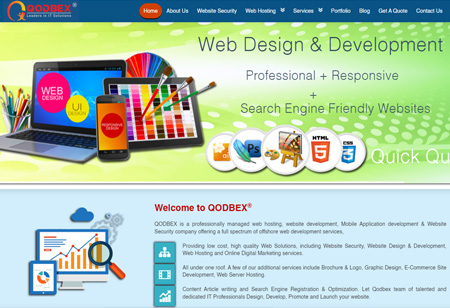
We design PREMIUM Logos which you can Trademark © ® ™
Logo designer, Logo Company, Logo Maker
Every Logo / Client / Brand / Business is Unique!
So are our IDEAS, Please scroll down to view our Logo Portfolio
India Best Logo Maker, India Best Logo designer, India Best Logo Design Company, India Best Logo Design, India Best Logo Artist

Logo Client
Resemble Systems
Karnataka, India


Director / Owner Info
Mr. Nazir


Logo Concept
We crafted a logo with a dark black-gray background, fostering a sense of stability and strength. The central focus is a prominent and modern "X" that symbolizes innovation and forward-thinking.


Surrounding it, subtle and calming light blue typography complements the overall design, promoting a tranquil atmosphere. The thoughtful balance of dark and light elements follows principles of harmony, creating a visually appealing and memorable logo.


This design aims to convey a sense of timeless elegance and innovation, capturing attention while exuding a serene and balanced energy.


Logo Work Done
Logo Re-Design

Logo Industry
ITes, IT, Software

Best Logo Maker, Best Logo designer, Best Logo Design Company, Best Logo Design, Best Logo Artist

Logo Client
Sisnet Spectrum Network
Kulalampur, Malaysia

Director / Owner Info
Mr. Vikneswaran

Logo Creative Concept
Needed a Corporate Brand Logo for an ITes Company with lots of strict Technical Guidelines as per Vaastu and Numerology Directions. It was one of my toughest logo in terms of execution and idea.

The unique symbol has an electronic board, the digital grid, the network mesh with hidden digits '1' '1' and digit '7' '7' concealed. The Squares in a unique symbolic forms a Business Network, A Data Network. The symbol depicts sisnet as a solution provider to various business.

The Square Grid shows sisnet as a Foundation, Protector, Enabler, Community, Direction, Stabilizing, Dependable. The symbolic squares also depicts Office Setups in GRID Form, the desks, the pcs, the laptops, the people.

Client History
A leading system integrator and also distributor of wireless & wired telecommunication equipments in Malasiya. The prime solutions are Carrier Grade peripherals i.e carrier class wifi equipment, carrier class microwave radio, carrier class ipabx and enterprise call center solutions.

Vastu Consultants Guidelines
1. must NOT be in red, black, purple or pink. Can be in technical (blue) or trendy (green)
2. no very sharp alphabet edges or in cursive manner
3. numerical digit '1' '1' / '7' '7' should be incorporated in hidden manner which can only be noticed if observed in detail or a Pyramid like letters or shape or vectors incorporated
4. logo design/letters/alphabet should be branding in nature so as to have subliminal effect on viewers
5. logo should reflect that the company is reliable, capable, successful and carrier class company
6. logo should be balanced as much, by keeping the "weight" of the graphics, colors, and size equal on each side.
7. The logo must also look good in black and white, grayscale, and two colors
8. Make sure the font is legible when scaled down, especially with script fonts.

Logo Work Done
Vaastu - Feng Shui - Astrology Based Logo Design

Logo Industry
Telecom


No 1 Logo Makers, Logo designers, Logo Design, creative Logo Artist

Logo Client
Merlin Tech Labs
USA, India


Director / Owner Info
Merlin Tech Labs


Logo Concept
The logo Concept integrates an abstract bird composed of four distinct elements, aligning with the client's numerological affinity for the number four.


The color palette includes green, red, yellow, and blue, symbolizing nature, passion, positivity, and trust, creating a harmonious visual narrative.


Sleek and simple fonts contribute to a modern and timeless aesthetic, ensuring clarity and sophistication.


Logo Work Done
Logo Design

Logo Industry
IT / ITes

Logo Maker, Logo designer, Logo Design Company, Logo Design, Logo Artist
Logo Design and Name Generator

Logo Client
Big Klap
Bangalore, India


Director / Owner Info
Mr. Parthasarathy


Logo Creative Concept
The Logo Typo is kept Simple & Bold for a better visibility, Brand Recall & Corporate Feel. There are some hidden elements in the Logo like Company Initials ‘b’  ‘k’  embedded within the Logo.


The Unique ‘bk’ Multiple Dots represents -  Connectivity, information exchange, networking, diversity - multiple requirements, multiple people (society). The ‘Digital Rays’ coming out from bigKlap shows ‘bigKlap’ as a HUB / ENABLERS emitting binary digit data ‘represented with dots’ - helping in progress, growth, communication, connectivity.


Client History
bigKlap was incubated as a tribute to small entrepreneurs and non profit organizations (NPO) who contribute immensely to the growth/well being of economies across the world. bigKlap provides Contacts Management, Accounting, Invoicing and Payment gateway solutions for Microenterprises / NGOs.


Logo Work Done
Logo Design

Logo Industry
Software Development Company, IT, ITes

No 1 Logo Makers, Logo designers, Logo Design, creative Logo Artist

No 1 Logo Makers, Logo designers, Logo Design, creative Logo Artist

Logo Client
Tera Bundle
India


Director / Owner Info
Tera Bundle

Logo Concept

A distinctive logo, centered around a combination of purple and black elements that draw immediate attention.

The design intricately weaves together text and graphic elements to create a visually compelling symbol.

At the forefront, the logo features the words "TERA BUNDLE" in a style that suggests significance and branding prowess.


The choice of colors, with purple implying creativity and luxury, and black denoting strength and sophistication, plays a crucial role in conveying the logo's essence.


Interestingly, the logo is not just a simple text-based design; it incorporates a line drawing that adds depth and complexity to the overall visual experience. This line drawing, executed in purple and black, hints at an underlying diagram or symbol that is integral to the brand's identity.


The design is meticulously crafted to ensure that it is recognizable and memorable, with a focus on legibility and aesthetic appeal. Despite the logo's complexity, it maintains a clean and uncluttered look, thanks to the judicious use of white space.


This not only enhances the logo’s visibility but also contributes to a sense of elegance and simplicity. Overall, the logo is a testament to the power of thoughtful design in creating a brand identity.


Logo Work Done
Logo Design


Logo Industry
ITEs, Cloud Computing, Research

No 1 Logo Makers, Logo designers, Logo Design, creative Logo Artist

Logo Client
Dotode
Red Feather Software
Rajkot, Gujarat


Director / Owner Info
Mr. Rupesh


Logo Concept

The logo for our ERP and Web Solution is a unique representation, featuring seven small and seven short pillars arranged horizontally.

This design choice is not only visually striking but also aligns with numerology, where the number seven is often associated with intuition, wisdom, and spiritual growth.


The horizontal arrangement suggests a seamless and organized flow, reflecting the efficiency and connectivity offered by the ERP and Web Solution.


Each pillar symbolizes a key aspect of the comprehensive services provided, forming a robust foundation for clients.

The incorporation of numerology adds an extra layer of meaning, signifying a harmonious balance and completeness in the solutions offered.

The choice of a balanced number also suggests reliability and a strong foundation, essential elements in ERP and Web Solutions.


The font used for the text reflects modernity and clarity, ensuring legibility and brand recognition. The color palette is carefully chosen to evoke trust, with a combination of blues and greens symbolizing reliability, innovation, and growth.


The overall design radiates a sense of professionalism, technological proficiency, and a forward-thinking approach, making it an ideal representation for ERP and Web Solutions.


Logo Work Done
Logo & Stationary Design


Logo Industry
ERP and Web solution

No 1 Logo Makers, Logo designers, Logo Design, creative Logo Artist

Logo Client
Quantamix Solutions
Pune


Director / Owner Info
Mr. Jitin

Logo Concept
The Concept logo for the IT company specializing in Cloud Services and ERP seamlessly combines modernity with traditional Vastu elements.

The company name is presented in a sleek and contemporary font, exuding professionalism and technological prowess.


On the right side of the text, a series of squares are intricately arranged, strategically covering the final letters of the company name. These squares symbolize data blocks, subtly illustrating the company's expertise in IT and ERP services. Inspired by Vastu principles, the arrangement of squares adheres to guidelines promoting balance and positive energy flow.


This integration not only reflects the company's commitment to cutting-edge technology but also signifies a holistic approach, incorporating traditional principles for a well-rounded and harmonious design.


Logo Industry
Analytics and AI company


Logo Work Done
Logo Design & Stationary Design

Sports Goods, Export Import logo desigers

Logo Client
GO OOPS
Chennai, India


Director / Owner Info
Mr. Arun Raj Vikram


Logo Concept
We created this numerology-inspired logo, we used 6 colours in this because Red for dynamic passion, green for harmonious healing, yellow for optimistic clarity, purple for spiritual wisdom, blue for calm communication, and pink for loving compassion.


The arrangement of six non geometrical rectangle shapes emphasizes the harmonious energy and balance attributed to the number six in numerology. This arrow signifies the client's journey towards progress and complements the numerological essence of six by adding a dynamic and purposeful element to the logo.


The overall composition captures the vibrancy of the client's brand and utilizes numerological principles to convey a sense of balance, responsibility, and positive momentum.


Logo Work Done
Logo Design

Logo Industry
IT Company, Cloud Service, ERP

No 1 Logo Makers, Logo designers, Logo Design, creative Logo Artist

Logo Client
Saravana
Karimagar, Telengana


Director / Owner Info
Mr. Shravan


Logo Concept

Our Concept logo for a Networking Website is designed to embody strength, connectivity, and a solid foundation. The logo seamlessly integrates typography with a symbolic visual element, creating a memorable and meaningful representation.


At the core of the design is a sleek and modern font that signifies the cutting-edge technology and sophistication of the networking platform. The font is clean and easily readable, projecting a sense of professionalism.


To the left of the text, a series of pillars stands tall and strong. These pillars are strategically placed to not only create a visually striking image but also to symbolize the robust support and connectivity offered by the networking platform.


Drawing inspiration from Vastu principles, the pillars are positioned to promote balance and harmony, reflecting the platform's commitment to creating a balanced and harmonious network of connections.


Logo Work Done
Logo & Stationary Design


Logo Industry
Networking Website

Sports Goods, Export Import logo desigers

Logo Client
Aarna
MP, India


Director / Owner Info
Mr. Yash Porwal


Logo Concept
The logo we designed featured a pyramid-style abstract 'A' symbolizing stability and growth, reflecting the solid foundation crucial in financial strategies.


Harmonizing colors like White for prosperity and stability, alongside blue for trust and reliability, this emblem signifies a balanced approach to wealth management, aligning with Feng Shui's principles of prosperity and harmony in financial planning.


Logo Work Done
Logo Design

Logo Industry
IT Company

Logo Maker Pune, Logo designer Pune, Logo Design Company Pune, Logo Design Pune, Logo Artist Pune

Logo Client
Easy Apps
United Kingdom


Director / Owner Info
Mr. Swapneel Rawal


Logo Concept
This vibrant logo Concept seamlessly blends color and nature, presenting a harmonious representation for the brand. The logo begins with rounded fonts where the first four letters, "easy," are adorned in a lively orange hue, radiating energy and warmth.


The subsequent three letters, "app," embrace a refreshing parrot green, evoking a sense of growth and vitality. The overall Concept communicates a dynamic and user-friendly brand ("easy") with a tech-savvy and nature-conscious approach ("app").


The carefully chosen colors and elements aim to create a memorable and visually appealing logo for the brand


Logo Work Done
Logo design

Logo Industry
Mobile Applications


Logo Maker, Logo designer, Logo Design Company, Logo Design, Logo Artist

Logo Client
Wireflower
Bangalore, India


Director / Owner Info
Ms. Veena


Logo Concept
In this astrology-inspired logo Concept, logo features a dynamic interplay of rounded stripes arranged in a spherical pattern, reminiscent of the cosmic energies that govern astrological principles. The blue color palette chosen for the stripes signifies cosmic wisdom, depth, and a connection to celestial influences.


Aligned with astrological symbolism, the first word in grounding gray represents stability, while the second word in celestial blue signifies expansiveness and the vast possibilities offered by the service brand. The rounded stripes, resembling planetary orbits, symbolize the interconnectedness of various services and the dynamic energy guiding them.


Logo Work Done
Logo Design

Logo Industry
Software Development Company, IT, ITes


Logo Makers, top Logo designers, Logo Design Company india, creative Logo designers, creative Logo Artist


Logo Client
Texolver
Ahmedabad, Gujarat, India


Director / Owner Info
M/S Texolver


Logo Concept
In this text logo Concept, simplicity and symbolism converge against a serene blue backdrop and modern font. A bold, stroked 'T' takes center stage, its clean lines exuding a sense of strength and stability.


Above the 'T,' a circular element forms a head, subtly resembling a human figure. This minimalistic representation suggests unity, humanity, and a forward-looking perspective.


Logo Work Done
Branding, Logo Design & Stationary Design, Broucher

Logo Industry
Software publishing, consultancy and supply, applications software, computer games software for all platforms


Logo Client
Tech Arrosoft Solutions Pvt Ltd
Bengaluru, India


Director / Owner Info
Mr. Ranganath Patil


Logo Concept
As pe golden ratio these two circles, strategically placed in the golden ratio, form a visually balanced and aesthetically pleasing composition. Within these circles, intricate patterns inspired by circuit boards or binary code symbolize the company's focus on technology and IT-enabled services.


The typography, clean and contemporary, complements the overall modern theme, ensuring professionalism and readability. The golden ratio placement emphasizes balance and precision, echoing the company's commitment to excellence.


This logo aims to convey a message of technological sophistication, seamlessly integrating innovation and precision. The design is well-suited for Google and other platforms, projecting a modern and dynamic image that aligns with the IT Company's cutting-edge services and expertise.


Logo Work Done
Branding, Logo Design & Stationary Design, Broucher


Logo Industry
IT Company, ITes


Logo Client
JSM
Bangalore, India


Director / Owner Info
Mr. J S Malhan


Logo Concept

The Concept behind the logo for JSM Technologies is the fusion of innovation and precision. The abstract symbol represents the dynamic and interconnected nature of modern technology, symbolizing growth and advancement.


The concentric circles or swirls embody the idea of continuous improvement and evolution, while the binary code along the edge signifies the company's focus on data-driven solutions and cutting-edge technology.


The overall design conveys a sense of expertise, forward-thinking, and a commitment to delivering high-quality technological solutions to clients.


Logo Industry
Human Resources Software, ITes, IT


Logo Work Done
Branding, Logo Design & Stationary Design, Broucher

No 1 Logo Makers, Logo designers, Logo Design, creative Logo Artist

No 1 Logo Makers, Logo designers, Logo Design, creative Logo Artist

Logo Client
QODBEX
Kerala, India


Director / Owner Info
Qodbex


Logo Concept

Our Concept logo for an Information Technology company is a harmonious blend of modern typography and visual symbolism. The primary focus is on a sleek and contemporary font that exudes professionalism and technological prowess. The company's name is artfully crafted in this font, ensuring a clean and legible representation.


To the left of the typography, a stylized "Q" takes center stage, embodying the company's commitment to quality and innovation. The Q is not merely a letter but a symbol of excellence, standing out with a modern and sophisticated design.


Positioned below the Q is a cheerful and happy person, symbolizing the human-centric approach of the Information Technology company. This visual element underscores the company's dedication to user satisfaction and a positive user experience.


The entire design is thoughtfully composed, with the Q and the happy person forming a cohesive and memorable image.


Logo Work Done
Logo


Logo Industry
Information technology company

Logo Client
Vajras Consultancy
New Jersey, USA


Director / Owner Info
Mr. Xitij Shah


Logo Concept
In this astrology-inspired logo Concept, the thunder sign within the company initial 'V' alludes to the powerful and dynamic nature of technology.


The name VAJRA, associated with strength and resilience, subtly reflects the robust solutions and services offered by the IT consulting firm.


This design symbolize the company's prowess in the technological realm, subtly connecting with astrological elements without explicitly stating its connection to the IT consulting industry.


Logo Work Done
Branding, Logo Design

Logo Industry
IT Consulting company

No 1 Logo Makers, Logo designers, Logo Design, creative Logo Artist

Logo Client
Cloud Symphony
MP, India


Director / Owner Info
Mr. Ankit Saxena


Logo Concept

Our Concept logo for IT Consulting Services seamlessly integrates modern typography with a visual representation that echoes the essence of cloud technology.


The central element of the logo is a clean and sophisticated font that signifies the professionalism and expertise offered by the consulting services.


Nestled within the letter "O" of the typography is a cleverly designed cloud motif, symbolizing the company's proficiency in cloud-based solutions and services. The cloud is depicted with fluid lines and a contemporary aesthetic, conveying a sense of innovation and adaptability.


This subtle yet impactful design element not only complements the IT focus but also reinforces the company's commitment to cutting-edge technology and cloud-based solutions.


The use of the cloud within the "O" not only adds a visually appealing dimension to the logo but also serves as a symbolic representation of the IT Consulting Services' core offerings.


Logo Work Done
Logo & Stationary Design


Logo Industry
IT Consulting Services


Logo Client
Teramax
Maharashtra, India


Director / Owner Info
Mr. Yuvraj Rajendra Chaudhari
Mr. Indrajeet Satish Baravkar


Logo Concept
A visionary abstract logo Concept that ingeniously integrates the form of a 'T' through a network of interconnected bonds in vivid shades of red, orange, and green.


This dynamic arrangement subtly alludes to the Concept of energy storage and transfer without explicitly mentioning it. The overlapping bonds symbolize the seamless flow and exchange of energy, embodying a sense of power and knowledge.


The color palette, ranging from the intensity of red to the vibrancy of green, suggests a spectrum of potential, mirroring the diverse capacities within.


Logo Work Done
Logo Design & Corporate Stationary

Logo Industry
IT Consultant


Logo Client
EPixel Software Pvt.Ltd
Dehradun, India


Director / Owner Info
Mr. Anil Kothiyal


Logo Concept
This logo is aligned with numerology, the initials EPS stand boldly in modern fonts, reflecting a sense of strength and contemporary aesthetics.


Surrounding these initials, five rectangles take shape, each representing the client's lucky number 5. The use of blue color adds a touch of calmness, trust, and stability.


The incorporation of the numerologically significant number emphasizes growth, adaptability, and positive change.


Logo Work Done
Logo Design & Stationary Design

Logo Industry
Custom Website Design,SEO, Ecommerce Websites


Logo Client
Techfield
New Delhi, India


Director / Owner Info
Mr. Ajit Kumar Singh


Logo Concept
As pe golden ratio theseTwo circles, strategically placed in the golden ratio, form a visually balanced and aesthetically pleasing composition. Within these circles, intricate patterns inspired by circuit boards or binary code symbolize the company's focus on technology and IT-enabled services.


The typography, clean and contemporary, complements the overall modern theme, ensuring professionalism and readability. The golden ratio placement emphasizes balance and precision, echoing the company's commitment to excellence.


This logo aims to convey a message of technological sophistication, seamlessly integrating innovation and precision. The design is well-suited for Google and other platforms, projecting a modern and dynamic image that aligns with the IT Company's cutting-edge services and expertise.


Logo Work Done
Logo Design

Logo Industry
Technology, IT, ITes, Consulting


Logo Client
Syncore
Alipore Kolkata, West Bengal


Director / Owner Info
Mr. Kiran Ranjane


Logo Concept
A professional and sleek logo designed for a company named SYNCCORE.


At the heart of the design is the company's ethos, "Synchronized Infrastructure," prominently displayed beneath the main title, suggesting a focus on harmony and integration within the technological or infrastructural sector.


The logo is characterized by its clean and modern typography, with "SYNCCORE" taking center stage in a bold, eye-catching font that conveys strength and reliability.


This logo is not just a brand identifier but a statement of purpose and ambition, designed to resonate with the target audience and leave a lasting impression.


Logo Work Done
Logo Design


Logo Industry
Cloud Computing, IT Company


Logo Makers, top Logo designers, Logo Design Company india, creative Logo designers, creative Logo Artist

Logo Client
iConnect
Kolkata, India


Director / Owner Info
Mr. Mangesh Bhagat


Logo Concept

A sophisticated logo for a phone repair company, encapsulating the essence of the business's commitment to affordable, quick, and reliable repair services. Dominated by a sleek black background, the logo stands out for its simplicity and professional appeal.


The use of a striking accent color captures the viewer's attention, hinting at the company's innovative and customer-focused approach. The text within the logo is designed with a clear and readable font, emphasizing the company's key attributes: affordability, speed, and reliability.


The upward lines depict typing fingers, the internet ports, the mobile / internet frequency, the group of people.


Logo Work Done
Logo Design & Stationary Design


Logo Industry
Mobile repair franchise chain

No 1 Logo Makers, Logo designers, Logo Design, creative Logo Artist

Logo Client
Gigafiber
Mumbai, India


Director / Owner Info
Mr. Perbjyot Singh


Logo Concept
This theme based modern logo that encapsulates the essence of connectivity and high-speed internet services.


Incorporate a dynamic icon that symbolizes data transmission, such as converging lines forming an abstract representation of a network signal.

Choose a color palette that blends shades of blue to evoke trust, reliability, and a sense of technology.


The font style should be clean and contemporary, reflecting the efficiency and innovation associated with broadband services.


Logo Work Done
Logo Design

Logo Industry
Broadband, ISP

No 1 Logo Makers, Logo designers, Logo Design, creative Logo Artist

Logo Client
The Geek Group
Ahmedabad, Gujarat


Director / Owner Info
Mr. Vikas Patel


Logo Concept

A distinctive logo that captures attention with its creative use of orange and green squares. The design is both simple and striking, making effective use of color contrast to enhance its visual appeal.


The dominant presence of white in the background and foreground emphasizes the logo and text, ensuring they are the focal points of the composition.


Central to the logo's design is the inclusion of a letter "G," which is ingeniously integrated within the geometric pattern, hinting at the identity or name associated with the logo.


The text accompanying the logo reads "The Geek Group," which is prominently displayed in a clear and legible font, suggesting the logo's affiliation with this group.


Logo Work Done
Logo Design


Logo Industry
IT, Multi Business

View Logo Design Gallery >>