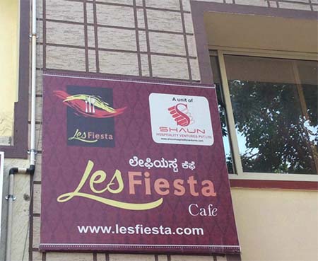
We design PREMIUM Logos which you can Trademark © ® ™
Logo designer, Logo Company, Logo Maker
Every Logo / Client / Brand / Business is Unique!
So are our IDEAS, Please scroll down to view our Logo Portfolio


Logo Client
Les fiesta
Bangalore, India


Director / Owner Info
Mr. Prashanth Srinivas Murthy


Logo Concept
Embodying a rich and elegant theme, this logo unfolds against a backdrop of royal purple. At its center, three gracefully poised spoons symbolize collaboration and unity, and dynamic black, oranges,and red for fire, evoke a sense of movement and passion.

The company name, in yellow and orange at the bottom, anchors the design with a touch of modernity.

Together, these elements encapsulate the essence of the brand, seamlessly blending creativity, adaptability, and energy in a visually captivating composition.


Logo Work Done
Branding, Logo Design & Stationary Design, Broucher

Logo Industry
Restaurant Chain


Logo Client
Arunai Publication
Tamil Nadu, India

Director / Owner Info
Dr. Kasi Kamalakkannan


Logo Concept
We crafted a logo who features an array of squares arranged in a mesmerizing circular pattern, creating a dynamic and engaging visual.

The squares, all rendered in a vibrant orange hue, seamlessly blend together to form a unified and harmonious composition. The circular arrangement symbolizes continuity, unity, and a sense of completeness.

The use of the bold and energetic orange color adds a touch of warmth and enthusiasm to the overall design, making it a distinctive and memorable representation of your brand.


Logo Work Done
Logo Design, Stationary,

Logo Industry
Research, Education and philanthropy

Top Logo Maker, Top Logo designer, Top Logo Design Company, Top Logo Design, Top Logo Artist

Logo Client
Green Chilliz
Delhi, India


Director / Owner Info
Mr. Prem Singh


Logo Concept
We crafted a typographical heavy logo for a Chinese food restaurant 'Green Chilliz' exuded with harmonious elements taken from Feng Shui Colors and Element Charts.

We used a dominant green color for stimulating appetite, Health, growth, and renewal Prosperity and wealth . Also balancing it with a subtle green tint represented balance and harmony.


Logo Work Done
Logo, Stationary & Website Design

Logo Industry
Restaurant Chain

Logo Maker, Logo designer, Logo Design Company, Logo Design, Logo Artist

Logo Client
Dev
UP, India


Director / Owner Info

Mr. Abhishek Rajput


Logo Concept
We Crafted logo as per astrology, who features an bold light blue font, radiating strength. Orbiting the brand name are four leaves, each symbolizing zodiac elements - two yellow for fire signs, one red for earth signs, and a green leaf for air signs.

This celestial palette and carefully crafted leaves create a visual tale, connecting the honey to cosmic forces shaping its flavors. Born from creative vision, this logo harmonizes astrology with the natural world, providing a distinctive identity resonating with the brand's celestial origins and the nuanced character of its honey.


Logo Work Done
Logo Design & Stationary Design

Logo Industry
Pharma Logo Industry


Logo Client
Vetasysnet Services
Mumbai, India


Director / Owner Info

Mr. Vivek Naik


Logo Concept
In this astrologically inspired logo, orange color in Veta, representing energy and vitality. At the end of the name, a spherical element emerges, symbolizing harmony and balance in alignment with Vastu principles.

Within this sphere is a meticulously drawn human figure, resonating with the energies of the Vastu Purusha. The ball itself is adorned with four distinct colors, each representing the essential elements of earth, water, fire, and air.

This vibrant and balanced composition not only echoes the principles of Vastu Shastra.


Logo Work Done
Branding, Logo Design & Stationary Design, Broucher

Logo Industry
System integration, IT Services, Telecom partner


Logo Client
Hotel GoldLeaf


Director / Owner Info

Mr. Pallav Bansal


Logo Concept
This logo integrates numerological symbolism with elegance for the hotel industry. The golden-colored "G" serves as the centerpiece, embodying prosperity and success in numerology. Inside the "G," a meticulously crafted tree emerges, symbolizing growth, stability, and a welcoming environment.

Adjacent to the "G," the golden "L" reinforces the theme of abundance and luxury. The choice of golden hues reflects wealth and sophistication.

Together, these elements form a harmonious logo, aligning with numerological principles, and conveying a sense of opulence and tranquility, ideal for the hotel industry.


Logo Work Done
Logo Design & Stationary Design

Logo Industry
Hotel


India Top Logo Maker, India Top Logo designer, India Top Logo Design Company, India Top Logo Design, India Top Logo Artist

Logo Client
Vajra Biotech,
Mumbai, India


Director / Owner Info
Mr. Sundaresh


Logo Concept
In this sun infused vastu logo have a "V," embodying balance, enclosed by the radiant sun representing vitality and prosperity. Nestled within the "V" are intricately designed green and light green leaves, symbolizing growth and the grounding forces of nature.

The sun's golden rays extend outward, infusing the entire design with warmth. This logo not only captures the positive influence of the sun but also aligns with Vastu principles, promoting harmony and growth.

The combination of the blue "V" and the sun, embraced by vibrant leaves, creates a visually impactful symbol for a space that seeks to embrace Vastu benefits.


Logo Work Done
Logo & Stationary

Logo Industry
Organic Products

India Top Logo Maker, India Top Logo designer, India Top Logo Design Company, India Top Logo Design, India Top Logo Artist

Logo Client
Suresh Metal Supply Corp
Mumbai, India

Director / Owner Info
Mr. Ankit Shah


Logo Concept
Abstract logo Sculpted with finesse, the logo introduces a modern rectangular canvas hosting a dynamic dance of design elements. Two sleek stripes elegantly converge within the frame, crafting a bold arrowhead that signifies forward momentum and purpose

Enveloped in a cool and sophisticated shade of blue, the entire composition exudes trust and professionalism. This abstract representation encapsulates brand's dedication to precision and innovation, unfolding a narrative of progress.

The strategic use of blue radiates a sense of calmness and reliability, establishing this logo as an emblem of strength and modernity for the brand.


Logo Work Done
Logo Design

Logo Industry
Steel Logo Industry

India Top Logo Maker, India Top Logo designer, India Top Logo Design Company, India Top Logo Design, India Top Logo Artist

Logo Client
Deve Herbs
Punjabi bagh, Delhi, India


Director / Owner Info
Mr. Vikas Bhardwaj


Logo Concept
Crafted in alignment with Vastu principles, this logo showcases a rounded pattern of numerous dots. At its core lies a milky-colored circle, surrounded by a purple circle, and within this concentric arrangement, a prominent orange flower blossoms.

The dots symbolize connectivity and unity, while the purple and milky circles evoke spirituality and purity. The central orange flower represents growth, prosperity, and vitality.

This logo is a visual representation of balance and positive energy, aligning with the principles of Vastu for a harmonious and auspicious brand identity.


Logo Work Done
Logo & label Design

Logo Industry
Spa, Herbal Products


Logo Client
TeamSmart Services India Pvt Ltd
India


Director / Owner Info
Mr. Sreekumar


Logo Concept
Incorporating numerological elements, the logo features five blue dots reminiscent of ludo dice, symbolizing the essence of change and unpredictability in life.

Surrounding these dots are four gracefully curved lines, each adorned in distinct colors, intersecting the boundaries of the dots.

These lines represent the four corners of life—health, wealth, love, and purpose—indicating the dynamic and interconnected nature of these aspects.

The vibrant colors signify the diverse energies at play, creating a visually dynamic and harmonious composition. This logo encapsulates the spirit of numerology, offering a unique blend of symbolism and aesthetic appeal.


Logo Work Done
Logo Design

Logo Industry
Enterprise Support Services

India Best Logo Maker, India Best Logo designer, India Best Logo Design Company, India Best Logo Design, India Best Logo Artist

Logo Client
Macoy's Restaurant
Kerela, India


Director / Owner Info
Mr. Ameer Alii


Logo Concept
This logo Concept draws inspiration from the iconic design elements associated with well-known fast-food establishments, utilizing a vibrant yellow color palette.

The rounded and welcoming shape aims to evoke a sense of familiarity and friendliness. The bold use of yellow brings a fresh and energetic vibe, creating an eye-catching and memorable visual identity.

The simplicity and universal appeal of the design make it versatile and easily recognizable. This logo Concept seeks to capture the essence of beloved fast-food experiences while offering a unique and distinctive visual representation for your brand.


Logo Work Done
Logo Design

Logo Industry
Restaurant, F&B

India Best Logo Maker, India Best Logo designer, India Best Logo Design Company, India Best Logo Design, India Best Logo Artist

Logo Client
Resemble Systems
Karanataka, India


Director / Owner Info
Mr. Nazir


Logo Concept
We crafted a logo with a dark black-gray background, fostering a sense of stability and strength. The central focus is a prominent and modern "X" that symbolizes innovation and forward-thinking.

Surrounding it, subtle and calming light blue typography complements the overall design, promoting a tranquil atmosphere. The thoughtful balance of dark and light elements follows principles of harmony, creating a visually appealing and memorable logo.

This design aims to convey a sense of timeless elegance and innovation, capturing attention while exuding a serene and balanced energy.


Logo Work Done
Logo Re-Design

Logo Industry
ITes, IT, Software

Logo Maker, Logo designer, Logo Design Company, Logo Design, Logo Artist

Logo Client
Sure Pure
Mumbai, India


Director / Owner Info
Mr. Raj Musale


Logo Concept
The Aquarius Essence logo weaves astrological inspirations into a celestial tapestry for a water company. Set against the Himalayan backdrop, cool blues and ethereal whites evoke the water sign Aquarius, creating celestial harmony.

The flowing mountain lines reflect water's fluidity, with the "P" forming a cosmic water droplet, embodying purity and life-giving energy.Embracing astrological influences, the Aquarius Essence logo channels lunar energies, enhancing intuition and emotional clarity.

This celestial design harmonizes with cosmic currents, promoting water's pure essence and forging a celestial connection.


Logo Work Done
Logo Design, Mineral Water Label

Logo Industry
Packaged Mineral Water

India Best Logo Maker, India Best Logo designer, India Best Logo Design Company, India Best Logo Design, India Best Logo Artist

Logo Client
Segreto
Bangalore, India


Director / Owner Info
Mr. Parag Thakur


Logo Concept
This logo Concept based on Vastu principles, the logo embraces rounded and curved fonts to promote a flowing and balanced energy.

The Earth symbol at the end, adorned with the Vastu-recommended colors of green, red, and blue, is strategically placed to enhance positive vibrations. Green symbolizes growth and prosperity, red represents passion and dynamism, and blue signifies stability and trust.

This Vastu-conscious design not only communicates balance and unity but also aligns the TerraHarmony brand with the principles of cosmic energy flow.


Logo Work Done
Logo Design

Logo Industry
ITes, IT, Software, eGovernance

India Best Logo Maker, India Best Logo designer, India Best Logo Design Company, India Best Logo Design, India Best Logo Artist

Logo Client
Enlighten Academy
Aurangabad, India


Director / Owner Info
Mr. Abhay Ubale


Logo Concept
The logo design featuring three rounded rectangles, creating a sense of unity and balance.Number 3 in numerology embodies creativity, communication, and vibrant energy.


Those influenced by it are expressive, socially adept, and optimistic. A logo inspired by the essence of 3 can convey dynamism, positivity, and a flair for communication.


Inside the of this calming backdrop, a rounded "e" in pristine white signifies efficiency and elegance. This meticulously crafted logo not only symbolizes unity but also communicates a commitment to clarity and precision within the brand.


Logo Work Done
Logo Design

Logo Industry
Education

India Best Logo Maker, India Best Logo designer, India Best Logo Design Company, India Best Logo Design, India Best Logo Artist

Logo Client
A2Z Marketing & Consultancy Services
Andhra Pradesh, India


Director / Owner Info
Mr. Sunil Kumar


Logo Concept
we crafted this abstract logo ,which have doted arrow and also a arrow in Z . Arrows symbolize diverse Concepts such as direction, strength, and protection.

In numerology, blue signifies calmness and effective communication, while red represents energy and passion. These colors can symbolize a harmonious blend of tranquility and vitality in various contexts.

They embody progress, guiding us forward, and represent the swiftness and efficiency needed to achieve goals. Whether pointing the way or serving as a shield, arrows carry dynamic meanings across cultures, encompassing various aspects of life


Logo Work Done
Logo Design

Logo Industry
Marketing Firm

View Logo Design Gallery >>