
Logo Client
Care Catalyst
India
Director / Owner Info
Care Catalyst
Logo Concept
In this pharmaceutical logo, five create a flower with five dots, embodying dynamic transformation.
Numerology adds adaptability, aligning with the industry's evolution. Carefully crafted, it symbolizes innovation, health, and the commitment to nurturing well-being through transformative solutions. In numerology 5 no indicate :-Adaptability, Versatility, Freedom, Communication, Progress.
Logo Work Done
Logo Design & Stationary Design
Logo Industry
Pharma
Logo Client
Kribha Pharma
Director / Owner Info
Polineni Surekha
Logo Concept
In this theme-based logo, the combination of purple and light blue colors symbolizes healing and tranquility. Inspired by Feng Shui principles, the color palette is strategically chosen to evoke a sense of balance, calmness, and well-being.
The integration of these colors, aligned with Feng Shui philosophy, aims to create a harmonious visual representation that reflects the pharmaceutical industry's commitment to health, serenity, and holistic care.
Logo Work Done
Logo Restoration
Logo Industry
Pharmaceuticals

Logo Client
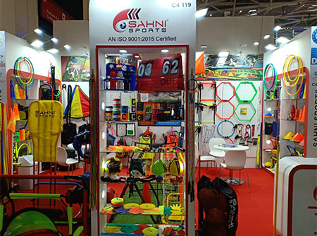
Sahni Sports
Meerut, India
Director / Owner Info
Mr. Vineet Sahni
Logo Concept
In vastu based logo based on feng Shui principles the tusk, reminiscent of strength and protection, signifies stability and success in sports.
The ball, a symbol of unity and teamwork, complement she bold union of red and black colors signifies aiery energy and profound wisdom, creating a space that inspires passion and strength. This dynamic duo fosters an environment of empowerment and transformative energy.
Logo Work Done
Logo Design
Logo Industry
Manufacturer And Exporter Of Sports Equipment
Logo Client
Apne Adhikar Janiye
Aligarh, UP, India
Director / Owner Info
Mr. Rohitash Kumar Vicky
Logo Concept
In this special logo it is Rooted in both astrology and numerology, the design echoed the organization's commitment to global harmony and insightful communication.
Three humans positioned above the earth reflected collaboration and stay with each other, while two doves and a hand emerging from the earth represented peace and shared knowledge.
Logo Work Done
Logo Design
Logo Industry
NGO, Non Profit Organization, Publication House, Media


Logo Client
Shree Rakshyan
Odisha, India
Director / Owner Info
Mr. Hara Gopal Patro
Logo Creative Concept
The Logo shape is corporate, strong with a square base (solid foundation), yet the design has Swiftness, modern approach. The Red color is taken to symbolize the goddess lakshmi and blue for the god vishnu.
The company initial 'S' with a rising sun, show positive energy, growth, faith and power.
Spiritual Hidden Symbol can also be seen as 'S' as sheeshnag and the high rise buildings / construction / road
structure as 'vishnupuri' under the hood of holy sheeshnag 'S'.
The 'S' shape also rises from bottom like a lotus stem with bhrama 'depicted as a source of light / sun at top'. As per Numerology of the owner 'as he has asked' - number 9 to be represented, which has been done by 9 rays of the sun.
Client Brief
As a member of a religious, God fearing family, I tried to register a name starts with Shree. It should be of two words. First word will be "Shree", which is one of the name of Goddess Laxmi and another word will be a name of Lord Narayana starts with letter "R" and then Infracon. Hence the initial will be "SRI".
Rakshyan or Rakshyana is a name of Narayana found in Vishnu Sahasra Nama. But unfortunately I could not found it available. So with a compulsion I opted this in a continuous single word as "Shree Shree Rakshyan".
Logo Color Half may be Red representing Goddess Laxmi and rest Amber / Orange / Blue for Lord Narayana.
Idea in mind for your Logo As I could not approve "Shree" and "Rakshyan" as separate word, I would like to give separate colour or any graphical separator to differentiate the two words.
Logo Work Done
Vaastu Based Logo Design
Logo Industry
Govt. Contractor, Road, Canal Bridge & Real Estate Developer
Logo Client
Daynite
Lucknow
Director / Owner Info
Tanvier Shamsi
Logo Concept
With astrological theme based logo -The use of dark blue and light blue colors aligns with astrological elements, where dark blue signifies depth and stability, while light blue represents healing and tranquility. Two hands joining in unity symbolize collaboration and compassionate care.
Logo Work Done
Logo & Stationary Design
Logo Industry
Healthcare, Hospital

Logo Client
Shidil Health Care
Pune (INDIA)
Director / Owner Info
Dileep Kumar Tiwari
Logo Concept
In this numerological logo - qualities associated with 2 plus signs symbolizes harmony, cooperation, and a supportive nature.
The emphasis on unity and balance can resonate with the holistic nature of healthcare, emphasizing the interconnectedness of physical, mental, and emotional well-being.
This design seamlessly wove together healing elements, illustrating a commitment to holistic health and care.
Logo Work Done
Logo Design & Stationary Design
Logo Industry
Health Care
Logo Client
Macro CNC
Maharashtra, India
Director / Owner Info
Mr. Santosh Balchand Dhoot
Logo Concept
We craft this holistic logo inspired by yoga and health, the infinity sign symbolizes the continuous flow of energy, embodying the seamless connection between mind and body. there is a human figure in a yoga pose rests upon a vibrant green flower, representing growth and vitality.
In the figure's head, a circle signifies spiritual oneness and unity. In astrology, this logo aligns with the idea of harmony and balance, mirroring the cosmic energies that influence well-being. This logo uniquely captures the essence of yoga and health brand, promising a harmonious journey toward well-being and self-discovery.
Logo Work Done
Logo & Stationary Design
Logo Industry
Education

Logo Client
GN Textile Pvt Ltd
Surat, India
Director / Owner Info
Mr. Gautam Hegde
Logo Concept
We crafted this logo where ultra-bold company initials "GN" in striking blue stand out with authority. Surrounding these initials are abstract multicolored leaf elements, adding a touch of nature's diversity.
A light text line complements the design. This Concept, named Bold Nature Glyph, is crafted for a brand seeking a powerful and visually appealing logo that seamlessly merges boldness with the vibrancy of nature.
Logo Work Done
Logo Design, Stationary Design
Logo Industry
Garment Exporter, Fabric Mill

Logo Client
M/S Ideal World
Bangalore, India
Director / Owner Info
M/S Ideal World
Logo Concept
A logo Concept that seamlessly intertwines astrological and numerological elements. Eight hands in a rounded pattern symbolize abundance and prosperity, aligning with the client's lucky numerology number, 8. At the core, a radiant star adds a celestial touch.
The color palette of green and blue enhances the cosmic theme, creating the Concept, Celestial Harmony Emblem. Crafted for a brand seeking a logo that harmonizes astrological symbolism and numerological significance, this design captures the essence of celestial balance and auspicious energy.
Logo Work Done
Branding, Logo Design & Stationary Design, Broucher
Logo Industry
Facility Management

Logo Client
IRIS Hotel
Kolkota, India
Director / Owner Info
Mr. Zakir Hussain
Logo Concept
This logo where simplicity meets beauty. Elegant fonts in white gracefully complement a stunning flower, all set against a regal purple background.
This Concept, Pure Elegance Bloom, is designed for a brand seeking a visually striking logo that captures the essence of simplicity and beauty in a harmonious composition.
Logo Work Done
Logo Design
Logo Industry
Hotel, Tourism
Logo Client
Organic Heaven
Surya Nagar Meerut, India
Director / Owner Info
Mr. Kawal Madan
Logo Concept
In this logo Earth draped in autumn leaves with a human beneath captures the spirit of organic living. Beyond visuals, it symbolizes the interconnectedness of nature and humanity.
With earthy tones and seasonal imagery, it embodies sustainability, reflecting the brand's dedication to providing wholesome, eco-conscious food choices for a harmonious and organic lifestyle. This logo shows how human and nature are dependent on each other.
Logo Work Done
Logo & Stationary Design
Logo Industry
Organic Food
Logo Client
AICPE
Nagpur, India
Director / Owner Info
Mr. Sharad Taori
Logo Concept
In this theme based logo takes flight with a metaphorical journey of personal growth. The airplane symbolizes progress and exploration, while the human figure at its core represents the individual's aspirations and potential.
This harmonious fusion signifies a transformative journey, where personal development and the pursuit of goals soar together.
The design encapsulates a theme of dynamic progress and self-discovery, aligning seamlessly with the Concept of reaching new heights and embracing one's full potential.
Logo Work Done
Logo & Stationary
Logo Industry
Consultancy, Education, Certification
Logo Client
Nitesh Hosiery
Hyderabad, India
Director / Owner Info
Mr. Girish Dongre
Logo Concept
In this fashion-centric theme based logo, the graceful depiction of a beautiful lady adorned with lotus petals on her dress evokes a sense of elegance and refinement.
The lotus, a symbol of purity and beauty, intertwines seamlessly with the fashion industry's aesthetics.
The combination of the lady and lotus petals encapsulates a theme of grace, beauty, and the ever-evolving allure of the fashion world.
Pink is also associated with femininity, charm, and beauty. It is a color that conveys a sense of sweetness, softness, and romanticism.
Logo Work Done
Logo Design
Logo Industry
Hosiery, Garment, Fashion
Logo Client
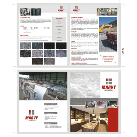
Marvy Granites
Martur, Andhra Pradesh, India
Director / Owner Info
Mr. Ramavath Hanumantha Rao
Logo Creative Concept
This logo Concept embodying Vastu principles and numerology, where seven rectangles converge. Two rectangles stand out in vibrant red, signifying energetic balance, while the remaining rectangles adopt a soothing gray tone.
The choice of seven rectangles aligns with the client's lucky numerology number. The brand name, presented in simple red and bold fonts, adds a touch of strength and clarity.
This Concept, named Vastu Harmony Seven, is tailored for a brand seeking a logo that harmonizes Vastu principles with numerological significance, creating a visually balanced and auspicious design. remove name and repetition
Logo Work Done
Logo, Stationary & Website
Logo Industry
Marble Exporter

Logo Client
Bellatrix Health Care
Ahmedabad, India
Director / Owner Info
M/s Bellatrix Healthcare
Logo Concept
In this astrology-inspired logo for Pharmaceutical Products, the star and crescent moon convey a celestial theme, symbolizing guidance, purity, and a natural balance of energies.
The star represents guidance and excellence in pharmaceuticals, akin to being a guiding light in healthcare. The crescent moon embodies healing, renewal, and the nurturing aspects of pharmaceutical products.
Logo Work Done
Logo Design & Stationary Design
Logo Industry
Pharmaceutical Products
Logo Client
Shree Ambika
Director / Owner Info
Mr. Durgesh Mishra
Logo Concept
This numerological based logo has shown that the letter "S" corresponds to the numerical value of 1, signifying innovation, leadership, and a pioneering spirit.
This numerical element adds an extra layer of meaning to the logo, suggesting that the firm is not just a supplier but a trailblazer in the building materials industry.
The hidden "S" subtly aligns with the brand's ambition to lead and innovate, reinforcing their commitment to providing cutting-edge materials for construction projects.
Logo Work Done
Logo Design, Stationary Design
Logo Industry
Building Material Supplier Firm

Logo Client
Sairath
Mumbai, India
Director / Owner Info
M/S Sairath
Logo Concept
The inclusion of a horse introduces a dynamic astrological touch. In astrology, horses symbolize freedom, strength, and swift movement, aligning seamlessly with the fast-paced nature of logistics and travel.
The horse, representing the astrological sign Sagittarius, embodies a spirit of exploration and adventure.
"SaiRath" is a term associated with the spiritual figure Sai Baba, a revered saint and spiritual teacher who lived in the late 19th and early 20th centuries in Shirdi.
Logo Work Done
Branding, Logo Design & Stationary Design, Broucher
Logo Industry
Logistics, Transportation & Travel
Logo Client
ADSIO
Topmark Industries Private Limited
West Godavari AP, India
Director / Owner Info
Mr. A K Kishore
Logo Concept
It's a theme based logo in which (A)is design with The varying green tones represent the diverse facets of care offered by the industry, including healing, rejuvenation, and holistic wellness.
The integration of multiple greens suggests a comprehensive approach to healthcare, embracing various aspects of physical, mental, and emotional well-being.
The color green, associated with nature and vitality, reinforces the brand's commitment to health and care.
Logo Work Done
Logo & Stationary Design
Logo Industry
Pharma & Healthcare Logo Industry

Logo Client
Aarna
MP, India
Director / Owner Info
Mr. Yash Porwal
Logo Concept
This logo harmoniously blends from numerology, astrology,
Numerology: The number associated with dark blue is 8 and 8 line of dark blue we have added which represents authority, power, and technological prowess.
The aircraft shape might be associated with air elements, signifying adaptability and forward-thinking.
Logo Work Done
Logo Design
Logo Industry
IT Company
Logo Client
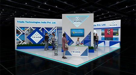
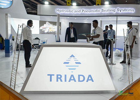
Triada
Bangalore, India
Director / Owner Info
Mr. Bony Paul
Logo Concept
The logo is from numerical theory -The pyramid's triangular shape resonates stability, power, and innovation—core elements in the IT industry.
Logo Work Done
Logo & Stationary Design
Logo Industry
IT Company
Logo Client
Bab Al Rahmanaeya
Sharjah UAE
Director / Owner Info
Mr. Sanjay Vincent
Logo Concept
The logo is from numerical theory -The number 5 is associated with versatility, adaptability, and dynamic energy.
Logo Work Done
Logo
Logo Industry
Grocery
© iMedia Ad Agency
www.logo-company.in
~Guru Aum Sushant Ji's Spiritual Website~
www.ShivaBlessings.com
(Business Astrology Numerology Vaastu Gemstones Rudraksha Yantras)