as per Business Owners Horoscope + Numerology Analysis + Navgraha Remedies


Logo Client
Inditrans
Mumbai, India
Director / Owner Info
Mr. Rajeev Gupta
Logo Concept
A numerologically guided logo which have Four bold fonts, representing stability and foundation, harmonize with five light fonts, symbolizing adaptability and dynamic energy.
The color purple and orange blends the spiritual and vibrant aspects of numerology. At the upper middle, a circular ring encapsulates the design, signifying unity and cycles of growth.
This numerology-inspired logo embodies balance, versatility, and the transformative energy of the numbers 4 and 5, promising a brand experience that resonates with both stability and dynamic evolution
Logo Work Done
Logo, Stationary
Logo Industry
Shipping, Logistics


Logo Client
Deva Consultancy Services Pvt. Ltd.
Pune, India
Director / Owner Info
Mr. Sagar. N
Logo Concept
We craft6ed this captivating astrology-inspired logo, where the letter 'D' takes center stage as the initial character, its contours gracefully shaped with modern curves for a contemporary and approachable appeal.
Within the 'D,' three pristine white dots form a celestial alignment, symbolizing purity and enlightenment, while one dot in vibrant orange strategically positioned represents the sun, embodying energy and the radiant power associated with astrology.
Accompanied by a modern, rounded font for the company name, this Concept seamlessly blends traditional astrological elements with a minimalist design approach, resulting in a logo that is both sophisticated and timeless, embodying the essence of our brand
Logo Work Done
Logo Design & Stationary Design
Logo Industry
Online Review Software


Logo Client
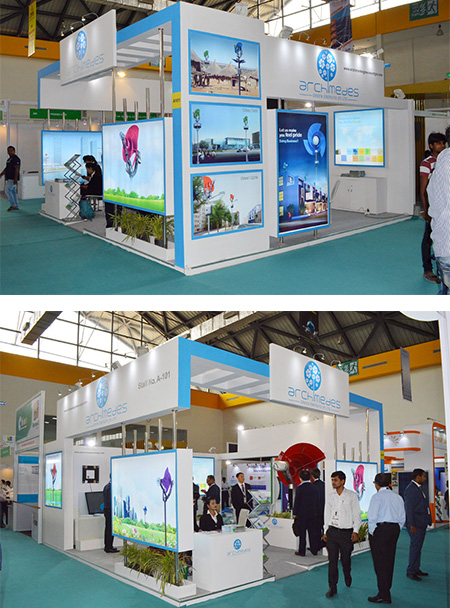
Archimedes
India
Director / Owner Info
Mr. Vijay Perumal
Logo Concept
The logo features a windmill designed as a symbol of renewable energy and eco-friendliness, with blades shaped like flower petals or a pinwheel.
The color palette reflects innovation, cooler world reducing green house global warming and sustainability. A modern, clean font is used for the company name to convey professionalism and innovation. The layout is balanced, with the windmill as the corporate brand icon - as a focal point and the flowers/pinwheel design prominently featured as fun, playful innocent, innovation, friendly.
The overall design is playful yet professional, and conveys the company's commitment to sustainable energy in a friendly and approachable manner.
Logo Work Done
Logo Design
Logo Industry
Wind energy, Clean Energy

Logo Client
Fairlead
Gujarat
Director / Owner Info
Mr. SVR Krishna
Logo Concept
The smartly design logo follows - Less is More approach - minimalism with organic green hue. The sleek typography incorporated a subtle wing-shaped 'e,' symbolizing elevation, growth, movement and progress.
Also the green color symbolized planet Mercury 'Budh'; which covers communication skills, intelligence, oratory skills, intellect, trade, commerce, and business'acumen.
Logo Work Done
Logo & Stationary Design
Logo Industry
Testing, Inspection & Certification agency

Logo Client
Hawk-I Investment & Insurance marketing Pvt. Ltd.
Ardee City, Gurgaon
Director / Owner Info
Mr. Sumit Sabharwal
Logo Concept
This theme based logo has 'H' and 'i' in the business name are creatively intertwined, forming a seamless and visually appealing connection.
The dot of the 'i' is cleverly designed as an eye, representing insight and vigilance in financial matters.The use of a classic, clean font exudes professionalism and trust, reflecting the reliability associated with financial services.
A tagline, 'A Step Toward Financial Well-Being,' is elegantly positioned beneath the logo, emphasizing the company's commitment to guiding clients on their journey to financial security.
Logo Work Done
Logo Design & Stationary Design
Logo Industry
Investment & Insurance marketing

Logo Client
Saavika
Gomti Nagar, Lucknow, India
Director / Owner Info
Mr. Kaushal Kishore
Logo Concept
In this mixture of Vastu and numerology principles, the design unfolds with two semicircles and two semi-cylinders artfully arranged to form a square. This geometric configuration symbolizes stability and balance in accordance with Vastu principles, imparting a strong foundation to the visual identity.
Each semicircle and semi-cylinder is assigned a representation with one semicircle embodying the essence of training, another encapsulating the spirit of consultation, and the semi-cylinders serving as symbols for technology and innovation.
Directional placement aligns with Vastu principles, potentially positioning the square in the northeast to enhance positive energy flow and cultivate an environment conducive to learning.
Logo Work Done
Logo & Stationary Design
Logo Industry
IT market-Training and Consultation

Logo Client
Fun Drones
Director / Owner Info
Alexander JM
Logo Concept
In this theme based logo the drone features a playful face, imbuing the design with a sense of joy and personality.
The vibrant red and black palette reflects both the freedom of flight and the cutting-edge technology of drones.
The central focus is on a sleek and dynamic representation of a drone in flight.
The modern font ensures clarity, and the tagline "Elevating Perspectives, Inspiring Innovation" captures the essence of the brand's mission
Logo Work Done
Logo Design & Stationary Design
Logo Industry
Drones
Logo Client
Dr Manjeet Institute of Critical Care
Jaipur, Rajasthan
Director / Owner Info
Dr Manjeet Singh
Logo Concept
Fluttering Elegance's logo is a harmonious combination of bold simplicity and artistic flair, with the company name in confident blue and a gracefully designed butterfly.
The artistic tagline font adds a touch of creativity, reflecting the brand's commitment to elegance and transformation. This logo is a distinctive representation of a brand that values both modernity and artistic expression.
Logo Work Done
Logo & Stationary Design
Logo Industry
Healthcare, Hospital

Logo Client
Ridge Enterprises
Telangana, India
Director / Owner Info
Manjan Kumar
Logo Concept
This logo combines typographical elegance with a distinctive ribbon-formed "R" in harmonious blue and red tones.
The blue color palette reinforces a sense of trust and reliability, while the ribbon design adds a touch of artistry.
This logo represents a brand dedicated to precision and craftsmanship, creating a memorable and visually appealing identity
Logo Work Done
Logo & Stationary
Logo Industry
Water proofing membrane non- woven geo textile steel fiber, Sodium nitrate, aluminum powder

Logo Client
Loyto
Purba Bardhaman
Director / Owner Info
Bappa Das
Logo Concept
vivid green text positioned against a pure white design, creating a visually appealing contrast that draws the viewer's attention immediately. The text itself is complemented by the presence of a square shape, which is mentioned twice, suggesting either a repetition or a significant emphasis on geometric simplicity within the design.
The use of green in the text is not arbitrary; it could signify growth, environmental consciousness, or a fresh start, depending on the context of the logo.
Given the high scores for attributes like font, logo, symbol, graphics, design, and typography, it is evident that this image was crafted with a keen eye for detail and a deep understanding of visual communication.
It stands as a testament to how typography and simple shapes can be leveraged to create a memorable and meaningful logo.
Logo Work Done
Logo Design & Stationary Design
Logo Industry
Led Lights Manufacturer


Logo Client
Comofi Medtech
Director / Owner Info
Mr. Satish Kalme
Logo Concept
The logo seamlessly weaves symbolism into a visual narrative, using a plus sign framework to signify positivity and unity. Within this structure, a square morphs into a blooming flower, representing the brand's commitment to growth and creative flourishing.
At the core, another plus sign underscores the importance of unity. The light color shade envelops the design, creating a serene atmosphere. Coupled with sleek fonts, this logo embodies a deeper meaning, capturing the essence of a brand dedicated to positive evolution, creativity, and a united core
Logo Work Done
Logo Design, Website Design
Logo Industry
Health Care

Logo Client
Delhi'Cancer'Clinic
New Delhi, India
Director / Owner Info
Mr. Shubham Garg
Logo Creative Concept
The two curves symbolize D and C of company initials of "Delhi Cancer Clinic". Subconsciously the overlapping / Venn diagram gives a feel of DNA, body cells and targeted solutions.
Logo Work Done
Logo Design
Logo Industry
Cancer'Treatment, Cancer Hospital

Logo Client
VYU
New Delhi, India
Director / Owner Info
Mr. Pawan Kalra
Logo Creative Concept
The logo Concept seamlessly combines the company's initials with four gracefully stylized leaves, embracing the client's numerological affinity for the number four.
Executed in a calming purple gradient, the design exudes sophistication and balance. The modern, refined typography ensures clarity, allowing the floral element to stand out.
This emblem symbolizes simplicity, unity, and a flourishing essence, aligning with the client's desire for a meaningful representation of growth and prosperity
Logo Work Done
Logo & Stationary
Logo Industry
Home Air Fresheners

Logo Client
Nanofil
New Delhi, India
Director / Owner Info
M/s Nanofil
Logo Concept
The logo for "NANOFIL" is a typographical design that conveys a sense of modernity and simplicity. The use of a clean, sans-serif font gives a contemporary look to the brand identity. The bold and uppercase letters create a strong visual impact, making the name of the brand easily recognizable and memorable.
The spacing between the letters is carefully balanced, enhancing readability and visual appeal. Overall, the typographical design of the logo communicates a sleek and professional image for the brand.
Logo Work Done
Branding, Logo Design & Stationary Design, Broucher
Logo Industry
Compounded Plastic Raw Material Manufacturer

Logo Client
Diva Multimedia
Toronto, Canada
Director / Owner Info
Ms. Philippa' Goodwine
Logo Concept
In this logo Concept, the sleek black symbolic font embodies modernity and precision, reflecting the industry's innovative spirit.
Two strategically placed yellow dots not only signify balance but align with numerology's connection of the number two with collaboration, harmony, and partnership'emphasizing the studio's collaborative approach in 3D design.
The company's name, presented in blue or black below, adds a touch of grounding contrast, echoing the numerological significance of stability and structure associated with these colors.
Logo Work Done
Logo Design, Letterhead, Business Card
Logo Industry
3D CAD

Logo Client
Jaagirdaar
Bangalore, India
Director / Owner Info
Mr. Karan Singh Rajguru
Logo Concept
This distinctive logo Concept combines a vibrant yellow background with a playfully unconventional touch. The color yellow radiates positivity, energy, and optimism, setting an inviting tone for the brand's journey.
The blue and red font, standing out against the yellow backdrop, signifies a dynamic and harmonious combination. Blue represents trust and reliability, while red adds a touch of passion and energy, conveying a brand that is both dependable and exciting.
'I' takes center stage with a charming mustache, injecting whimsy and personality. This creative detail hints at the brand's approach'a perfect blend of professionalism and a dash of humor.
Logo Work Done
Logo Design
Logo Industry
Fashion Brand, Apparel

Logo Client
Medvitaz'Pharma Solutions and Supplies
India
Director / Owner Info
Medvitaz'Pharma Solutions and Supplies
Logo Concept
The logo with three inviting colors and a graceful touch. Multiple rounded arrows intertwine, symbolizes VITA 'VITALITY' - power, energy, sun, hope, care, transformation, synergy, teamwork, innovation.
Logo Work Done
Naming, Logo Design & Stationary Design
Logo Industry
Medicine trading, Import & Export, Pharma

Logo Client
Maxion
Coimbatore, India
Director / Owner Info
Mr. K. Ganesan
Logo Concept
The chosen font, with its letters, imparts a robust and authoritative presence. This fusion symbolizes the industry's commitment to precision and quality control in the manufacturing process.
The color palette, featuring deep blue and orange hue with a touch of metallic accent, communicates reliability, trust, and an industrial touch.
Overall, the Maxion logo conveys a message of professionalism and excellence, positioning the brand as a leader in delivering precise and reliable solutions within the industry.
Logo Work Done
Branding, Logo Design & Stationary Design, Broucher
Logo Industry
PVC, UPVC Pipes, Sanitaryware

Logo Client
Yasamin Valery
Liverpool , UK
Director / Owner Info
Yasamin Valery
Logo Concept
In this logo Concept, simplicity and sophistication converge through light, artistic fonts, complemented by a dynamic square formed by intersecting multicolored lines.
The abstract design symbolizes the brand's diverse and creative identity, emphasizing unity within the spectrum of its offerings. This visual representation aims to convey a meaningful message of harmonious diversity, contemporary elegance, and a brand deeply committed to creativity and inclusivity.
Logo Work Done
Logo Design
Logo Industry
Consultant, Freelancer

Logo Client
The Lake Resort
Naukuchaital, India
Director / Owner Info
Mr. Verma / Mr. Arjun Verma
Logo Concept
In this minimalistic logo Concept, the emphasis is on simplicity and modernity. The logo features sleek and typographical modern fonts in a subtle gray color. The use of gray exudes sophistication, neutrality, and a timeless aesthetic, making it versatile for various applications.
The clean lines and straightforward design convey a sense of simplicity, reflecting a brand identity that is refined and uncluttered. The minimalist approach allows for easy recognition and readability, ensuring the logo remains impactful across diverse platforms.
Logo Work Done
Logo Vector Recreation, Website
Logo Industry
Hotel, Resort, Lakeside Retreat

Logo Client
Adroit Marketing
Uttarpradesh, India
Director / Owner Info
Mr. Arjun Vyas
Logo Concept
In this logo Concept inspired by numerology, the design takes the form of an eye-shaped emblem. The eye is a powerful symbol representing intuition, awareness, and vision, aligning with the principles of numerology that emphasize spiritual insight and balance.
The eye is composed of two fluid blue curved lines, symbolizing harmony, duality, and the balance of opposites. Within the eye, a mesmerizing pattern of black and white dots creates a captivating focal point, forming a symbolic representation of the numeral "8" ' the number associated with balance, infinity, and the cyclical nature of life.
Logo Work Done
Logo Design, Print Material
Logo Industry
Security Equipments, CCTV Cameras, Communication Devices

Logo Client
Alliance Digitech Pvt Ltd
Noida, UP, India
Director / Owner Info
Mr. M Chandrasekaran
Logo Concept
Centered on the principles of numerology, this logo features three interconnected circles in red, green, and blue, symbolizing unity and harmony.
The bold and aesthetically pleasing fonts add strength and balance to the design, echoing the brand's alignment with cosmic energies. Numerologically significant, the trio of circles conveys a meaningful and cohesive representation, emphasizing the brand's commitment to a harmonious and balanced identity.
Logo Work Done
Logo & Stationary
Logo Industry
Office Automation like MFDs, Multi Media Projectors, Interactive Flat Panel Displays and Digital Teaching Devices.

Logo Client
Imperial Quartz
Gujarat, India
Director / Owner Info
Mr. Aziz Theba
Logo Concept
In this Vastu-inspired logo Concept, the company initials take the form of a clock as per their work, where the letter 'Q' serves as the round face, and the letter 'I' becomes the needle pointing at the hours.
This design brings a sense of timelessness and order, aligning with Vastu principles. Additionally, a crown atop the initials adds a touch of reality and authority, symbolizing the company's prominence and strength.
Logo Work Done
Branding, Logo Design & Stationary Design, Broucher
Logo Industry
Clock Manufacturing Logo Industry

Logo Client
Aashirwad Agro
Hisar, India
Director / Owner Info
Mr. Sanjay Garg
Logo Concept
In this logo Concept, company initial "A" is adorned with a leaf cut at the center, encapsulated within a serene green circle. The use of nature green hues adds an organic touch, and the fonts complement the natural theme.
This Concept, named Nature Enclave Emblem, is crafted for a brand seeking a logo that fully embodies a natural feel, creating a visually refreshing and harmonious identity
Logo Work Done
Logo Editing, Brand Consultancy
Logo Industry
Edible Oil, Cattle Feed, Agricultural Tools

Logo Client
Rayainox
Maharashtra, India
Director / Owner Info
Mr. Ravi Yawalkar
Logo Concept
The logo inspired by the Bazi chart. A central rectangle, adorned in calming blue, signifies stability. Positioned above, a smaller rectangle in silver represents wisdom and adaptability. Below, a subtle sky-blue rectangle symbolizes growth and opportunity.
This design aligns with the elements of the Bazi chart. The geometric harmony of rectangles mirrors the balance sought in Bazi, offering a visually meaningful logo for your business.
Logo Work Done
Logo, Stationary & website Design
Logo Industry
Designer colored stainless steel sheets
Call Ms. Vijaya
Mobile / WhatsApp: +91 - 73106 39500 (10 am to 7 pm)
*** If numbers are busy / not picked, kindly WhatsApp ***
or Email us at: imediainfotech@gmail.com
Naming + Logo Website: www.Logo-Company.in
Guru Ji's Youtube Channel
www.youtube.com/@AumSushant
Guru Aum Sushant Ji's Site
www.ShivaBlessings.com