as per Business Owners Horoscope + Numerology Analysis + Navgraha Remedies


Logo Client
Montec
Director / Owner Info
M/s Montec
Logo Concept
This energetic Vastu shastra based logo, featuring four intersecting triangles symbolizing the essential elements of earth, water, fire, and air.
Within each triangle, representative icons for diverse business sectors signify the varied ventures encompassed.
The overlapping triangles convey the interconnectedness of these businesses, emphasizing synergy and collaboration.
Logo Work Done
Logo, Stationary & Website Design
Logo Industry
Multi Business

Logo Client
Mark Shipping Services
Gandhidham, Kutch, India
Director / Owner Info
Mr. Harsh A Thacker
Logo Creative Concept
Created a logo based on astrology-numerology for a shipping company, incorporating a globe and a 3D phoenix bird holding it, is a fascinating blend of symbolism.
This design harnesses the celestial power and the transformative symbolism of the phoenix. The phoenix, a symbol of rebirth and renewal, signifies resilience and adaptability, crucial traits in the shipping business.
The globe represents a global reach, aligning with the shipping industry's expansive nature. As per clients lucky numerology there are hidden elements placed inthe logo design. For instance, the number of wing sections.
Logo Work Done
Logo & Stationary
Logo Industry
Shipping and Logistics

Logo Client
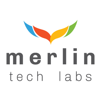
Merlin Tech Labs
USA & Tirupati, India
Director / Owner Info
Merlin Tech Labs
Logo Concept
The logo Concept integrates an abstract bird composed of four distinct elements, aligning with the client's numerological affinity for the number four.
The color palette includes green, red, yellow, and blue, symbolizing nature, passion, positivity, and trust, creating a harmonious visual narrative. Sleek and simple fonts contribute to a modern and timeless aesthetic, ensuring clarity and sophistication.
Logo Work Done
Logo Design
Logo Industry
IT / ITes

Logo Client
Aashirwad Agro
Hisar, India
Director / Owner Info
Mr. Sanjay Garg
Logo Concept
In this logo Concept, company initial "A" is adorned with a leaf cut at the center, encapsulated within a serene green circle. The use of nature green hues adds an organic touch, and the fonts complement the natural theme.
This Concept, named Nature Enclave Emblem, is crafted for a brand seeking a logo that fully embodies a natural feel, creating a visually refreshing and harmonious identity
Logo Work Done
Logo Editing, Brand Consultancy
Logo Industry
Edible Oil, Cattle Feed, Agricultural Tools

Logo Client
Ramniwas Sarraf Private Limited
Gorakhpur, India
Director / Owner Info
Mr.Vikas Sarraff
Logo Concept
Crafted under celestial influences, the jewelry logo intertwines the company initials 'RN' with the celestial sun (God of Gold) and 5 lucky elements as petal motif along with abstract hidden Indian rupee symbol.
Infused with astrological brilliance of Surya Graha, this emblem symbolizes cosmic beauty and radiance, reflecting our commitment to offering jewelry that illuminates personal style while embracing cosmic connections.
Logo Work Done
Logo Design, Stationary Design,
website Design
Logo Industry
Jewellery
To Book an Appointment with Guru Aum Sushant
📞 Call or WhatsApp Ms. Vijaya at:
+91-7310639500
✉️ Email us:
info@logo-company.in,
imediainfotech@gmail.com
🕙 Time: 10:00 AM to 7:00 PM IST


Logo Client
Rayainox
Maharashtra, India
Director / Owner Info
Mr. Ravi Yawalkar
Logo Concept
The logo inspired by the Bazi chart. A central rectangle, adorned in calming blue, signifies stability. Positioned above, a smaller rectangle in silver represents wisdom and adaptability. Below, a subtle sky-blue rectangle symbolizes growth and opportunity.
This design aligns with the elements of the Bazi chart. The geometric harmony of rectangles mirrors the balance sought in Bazi, offering a visually meaningful logo for your business.
Logo Work Done
Logo, Stationary & website Design
Logo Industry
designer colored stainless steel sheets

Logo Client
Inditrans
Mumbai, India
Director / Owner Info
Mr. Rajeev Gupta
Logo Concept
A numerologically guided logo which have Four bold fonts, representing stability and foundation, harmonize with five light fonts, symbolizing adaptability and dynamic energy.
The color purple and orange blends the spiritual and vibrant aspects of numerology. At the upper middle, a circular ring encapsulates the design, signifying unity and cycles of growth.
This numerology-inspired logo embodies balance, versatility, and the transformative energy of the numbers 4 and 5, promising a brand experience that resonates with both stability and dynamic evolution
Logo Work Done
Logo, Stationary
Logo Industry
Shipping, Logistics

Logo Client
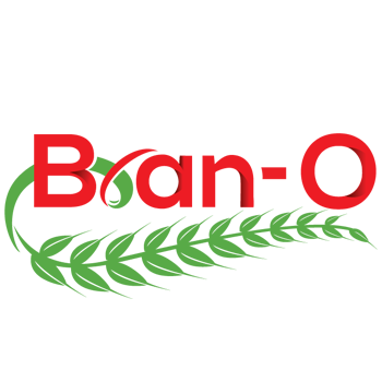
Bran-o
Mumbai
Director / Owner Info
Mr. Kunal Batra
Logo Concept
Harmoniously integrated typography based logo.
The selected font, balancing rustic charm with modernity, reflects the natural and wholesome quality inherent in baked goods. A creative touch is added to the letter "R" in where it takes the form of a raw wheat stem extending upwards.
This visual element not only links the company's name with its primary ingredient but also symbolizes the foundational nature of wheat in its products.
With a brief tagline beneath the logo, emphasizing the company's commitment to healthy and nutritious offerings, this logo narrates a story of tradition, craftsmanship, and a dedication to quality in Gomti Healthy Nutrients Private Limited's line of bread and baked goods.
Logo Work Done
Logo Design & Stationary Design
Logo Industry
Bread and baked goods manufacturing company

Logo Client
Amrit Music Pvt. Ltd.x
Mr. Gagandeep Singh (Saby)
Logo Work Done
Logo, Stationary & website Design
Logo Concept
The Concept centers on a vibrant green Earth, symbolizing the global reach of musical instrument exports. The letter 'A' is seamlessly integrated, forming a protective shape that represents the client's comprehensive role in international instrument trade.
Subtle musical notes within the design convey the industry's essence, and a gradient effect signifies the dynamic nature of music. A carefully selected color palette, including earthy tones and a touch of black or silver, adds sophistication.
The professional font ensures clarity and readability, making the logo visually appealing and versatile across various applications.
Logo Industry
Manufacturer and exporter of high quality musical instruments

Logo Client
Nava
Andhra Pradesh, India
Director / Owner Info
Mr. Shaik Abdul Ali
Logo Creative Concept
In this logo Concept, a gracefully soaring bird, wings spread wide, adds a touch of vitality and freedom to the brand's identity. The playful scene unfolds within a vibrant circular frame, blending the invigorating hues of orange and green.
Depicting the bird sipping from a straw introduces a whimsical and lighthearted element, emphasizing the brand's commitment to joy and refreshment. The overall design encapsulates a sense of dynamic energy and zest, making it a memorable and engaging emblem for a brand associated with leisure and enjoyment.
Logo Work Done
Logo, Stationary & website Design
Logo Industry
Export & Import Fruits & Vegetables

Logo Client
UP22
Rampur, Uttar Pradesh, India
Director / Owner Info
Mr. Naresh Kumar Singhal
Logo Concept
Against a vibrant red backdrop, the logo Concept for a culinary brand embraces bold, white fonts to convey a clear and impactful visual identity. Cleverly integrating a fork within the letter 'P,' a spoon within 'U,' and a green leaf within '2,' the design subtly communicates a commitment to fresh and wholesome dining experiences.
The bold contrast of red and white adds a striking and modern touch, while the incorporation of utensils and a leaf signifies a dedication to culinary delight and nourishing ingredients.
This logo aims to resonate with a contemporary audience, promising a memorable and enjoyable journey in the world of gastronomy.
Logo Work Done
Naming, Branding, Logo Design & Stationary Design, Broucher
Logo Industry
A upscale vegetarian Dhaba

.jpg)
.jpg)
Logo Client
Roti Indian Cuisine
Malta
Director / Owner Info
Mr. Gajesingh Bist
Logo Concept
This thought full typography based logo has selected the bold and modern font exudes dynamism and excitement, accentuated by thoughtful letter spacing for a balanced and engaging layout.
A creative touch is introduced with the integration of a stylized flame, seamlessly incorporated into the letter "o" of 'Roti'.
This fiery element not only adds a distinctive character to the logo but also symbolizes the passion, speed, and intense flavors associated with the restaurant's cuisine, particularly in the context of take-away and delivery services.
The warm and vibrant color palette, featuring shades of red, orange, and yellow, further amplifies the logo's association with the energy and intensity of fire.
In essence, the Roti ogo becomes a vivid representation of a culinary venture that delivers both flavor and excitement directly to the customer's doorstep.
Logo Work Done
Logo Design, Signage
Logo Industry
Restaurant/ Takeaway delivery

Logo Client
Jaagirdaar
Bangalore,India
Director / Owner Info
Mr. Karan Singh Rajguru
Logo Concept
This distinctive logo Concept combines a vibrant yellow background with a playfully unconventional touch. The color yellow radiates positivity, energy, and optimism, setting an inviting tone for the brand's journey.
The blue and red font, standing out against the yellow backdrop, signifies a dynamic and harmonious combination. Blue represents trust and reliability, while red adds a touch of passion and energy, conveying a brand that is both dependable and exciting.
'I' takes center stage with a charming mustache, injecting whimsy and personality. This creative detail hints at the brand's approach'a perfect blend of professionalism and a dash of humor.
Logo Work Done
Logo Design
Logo Industry
Fashion Brand, Apparel

Logo Client
Delhi Cancer Clinic
New Delhi, India
Director / Owner Info
Dr. Shubham Garg
Logo Creative Concept
The logo is designed using lucky astrology Numerology colors and curvy shapes as two curves symbolize D and C of company initials of "Delhi Cancer Clinic".
Subconsciously the overlapping / Venn diagram gives a feel of DNA, body cells and targeted solutions.
Logo Work Done
Logo Design
Logo Industry
Cancer Treatment, Cancer Hospital, suggesting solutions by Surgery,
Radiation Therapy,
Chemotherapy,
Immunotherapy,
Targeted Therapy,
Hormone Therapy,
Stem Cell Transplant,
Precision Medicine

Logo Client
Chloris
Hyderabad, India
Director / Owner Info
Mr. Ranjeet kumar
Logo Concept
In this logo Concept, the design features two mirrored Cs in a calming green hue, symbolizing growth and health. Positioned between these Cs is a bold H in a vibrant red shade, representing vitality and energy.
At the heart of the H, a red plus sign signifies the company's commitment to providing essential medical solutions. This carefully curated color palette aims to evoke a sense of balance, wellness, and dynamism.
Logo Work Done
Logo Design
Logo Industry
Medical Equipments

Logo Client
Resemble Systems
Karnataka, India
Director / Owner Info
Mr. Nazir
Logo Concept
We crafted a logo with a dark black-gray background, fostering a sense of stability and strength. The central focus is a prominent and modern "X" that symbolizes innovation and forward-thinking.
Surrounding it, subtle and calming light blue typography complements the overall design, promoting a tranquil atmosphere. The thoughtful balance of dark and light elements follows principles of harmony, creating a visually appealing and memorable logo.
This design aims to convey a sense of timeless elegance and innovation, capturing attention while exuding a serene and balanced energy.
Logo Work Done
Logo Re-Design
Logo Industry
ITes, IT, Software
Call Ms. Vijaya
Mobile / WhatsApp: +91 - 73106 39500 (10 am to 7 pm)
*** If numbers are busy / not picked, kindly WhatsApp ***
or Email us at: imediainfotech@gmail.com
Naming + Logo Website: www.Logo-Company.in
Guru Jis Youtube Channel
www.youtube.com/@AumSushant
Guru Aum Sushant Ji's Site
www.ShivaBlessings.com