as per Business Owners Horoscope + Numerology Analysis + Navgraha Remedies

Logo Client
Nanofil
New Delhi, India
Director / Owner Info
M/s Nanofil
Logo Concept
The logo for "NANOFIL" is a typographical design that conveys a sense of modernity and simplicity.
The use of a clean, sans-serif font gives a contemporary look to the brand identity.
The bold and uppercase letters create a strong visual impact, making the name of the brand easily recognizable and memorable.
The spacing between the letters is carefully balanced, enhancing readability and visual appeal.
Overall, the typographical design of the logo communicates a sleek and professional image for the brand.
Logo Work Done
Branding, Logo Design & Stationary Design, Broucher
Logo Industry
Compounded Plastic Raw Material Manufacturer

Logo Client
AIRF
Tamil Nadu, India
Director / Owner Info
Dr. Kasi Kamalakkannan
Logo Concept
This logo Concept is centered on a dynamic "A" shape, seamlessly incorporating a captivating vibrant green color, symbolizing growth, freshness, and harmony.
The auspicious lines, in a lively yellow color symbolizes 'Devguru Bhrapthi' Jupiter God of Knowledge, Wisdom and the main green color 'Budh Dev - Mercury' color of publishing & communication.
Logo Work Done
Logo Design, Stationary
Logo Industry
Research, Education, Philanthropy

Logo Client
Deep Sea Shipping Logistics
Gujrat, India
Director / Owner Info
Mr. SVR Krishan
Logo Concept
This logo have a powerful and symbolic anchor, evoking a sense of stability, reliability, and maritime strength. The dominant blue color palette conveys a connection to the sea and sky, symbolizing trust, integrity, and the vastness of logistics services.
At the center of the logo is a substantial anchor, representing the industry's steadfast commitment to secure and efficient transportation. Its size and presence suggest a reliable support system, emphasizing the stability and dependability offered by the logistics company.
The incorporation of the word "sea" in dark blue font not only aligns with the maritime theme but also subtly implies the global reach and expansive services provided by the logistics brand.
Logo Work Done
Logo Design & Stationary Design
Logo Industry
Logistics

Logo Client
Varjish Must
Patiala, India
Director / Owner Info
Mr. Kamal Kaushik
Logo Concept
The dynamic logo Concept ,features a strong and formidable human figure formed by a distinctive V shape. The figure embodies the essence of strength, power, and athleticism, reflecting the core values of the fitness and gym. The arms are intentionally designed to evoke the image of a wrestler, emphasizing resilience and determination.
With a focused expression, the head of the figure signifies mental strength and discipline, essential components of any successful fitness journey. The overall shape creates a sense of forward momentum, symbolizing progress and personal growth through physical fitness.
The chosen color palette, perhaps bold and energetic tones like red or black, adds a sense of vibrancy and intensity to the logo, aligning with the vigor associated with gym workouts.
Logo Work Done
Logo & Stationary
Logo Industry
Gym

Logo Client
Rakesh Sharma
Dubai, London, India
Director / Owner Info
Rudrax
Logo Concept
In this minimalistic logo Concept, a single, refined curved line takes center stage. The simplicity of the line symbolizes the fluidity and interconnected nature of financial markets.
Its elegant design suggests precision, strategy, and the dynamic movements inherent in the trading industry.Accompanying the minimalist graphic, the company's name is presented in a modern and sophisticated red font.
The bold red adds a touch of vibrancy, representing urgency, dynamism, and the excitement associated with trading activities.
Logo Work Done
Logo
Logo Industry
Trading, Import Export, Shipping
.jpg)
Logo Client
Triada
Bangalore, India
Director / Owner Info
Mr. Bony Paul
Logo Concept
The logo is from numerical theory -The pyramid's triangular shape resonates with the number 3 in numerology,thats why we have added 3 colour in it.
which is symbolizing creativity, communication, and innovation'core elements in the IT industry.
Logo Work Done
Logo & Stationary Design
Logo Industry
IT Company
Logo Client
Koush Facility Management
Bangalore, India
Director / Owner Info
Mr. M. Vekatesan
Logo Concept
In this thoughtfully crafted theme logo design, the leaf-like structure symbolizes not just growth and vitality but also resilience, reflecting the leaf, an emblem of nature's intricate beauty, imparts a touch of freshness, symbolizing the consultancy's dedication to cultivating careers with a refreshing and sustainable approach.
The deep blue, evoking a sense of professionalism, is complemented by a modern font ensuring clarity, mirroring the consultancy's commitment to precision and transparency.
Together, these elements forge a logo that resonates with growth, professionalism, and the enduring allure of fresh possibilities
Logo Work Done
Logo Design
Logo Industry
Manpower Consultant
Logo Client
Leon
Bangalore, India
Director / Owner Info
Mr. Chandu Mandani
Logo Concept
This fashion logo Concept combines modern elegance with a touch of minimalism. Against a sleek black background, the brand's name is presented in contemporary white fonts, radiating sophistication and simplicity.
At the forefront, a striking company initial blue "L" is elegantly placed within a rectangle, creating a focal point that captures attention. The overall logo symbolizes depth, trust, and a sense of calm, reflecting the brand's commitment to timeless style and reliability.
Four strategically positioned dots 'Buttons' add a subtle yet impactful detail, suggest 1. Design 2. Quality 3. Craftsmanship 4. Fashion
Logo Work Done
Logo Design
Logo Industry
Fashion Brand, Garment Export
Logo Client
Eminence Saffron
Bangalore, India / Iran
Director / Owner Info
Qeshm International Trading
Logo Concept
A rich backdrop of dark and light brown, reminiscent of the saffron spice, an elegant oval shape takes center stage. The oval signifies completeness, unity, and the holistic approach of the brand in the saffron trade.
At the top of the oval, a stylized crown, infused with the warmth of yellow edges, symbolizes the upward trajectory of growth and success business. Below the oval, the company name is presented in modern fonts, adding a touch of sophistication and professionalism.
The color palette and design elements harmonize to create a logo that resonates with the aromatic and premium qualities of saffron, portraying the brand as a distinguished player in the import/export market.
Logo Work Done
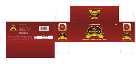
Logo, Stationary Design & packaging
Logo Industry
Saffron Import / Export
Logo Client
Hindustan Corporate Group
Chennai, India
Director / Owner Info
Mr. Paari Senthil Kumar
Logo Concept
The logo design features a bold red "H" at the heart, embodying the core strength of the brand. Majestic golden sheds on both sides extend like wings, symbolizing harmony and unity.
Numerology-inspired logo featuring golden and red hues. Centered around a bold 'H,' it embodies success, passion, and prosperity'a powerful symbol of strength and positive vibrations for your brand identity.
Logo Work Done
Logo Design
Logo Industry
Multi Trade Group
Logo Client
Minerals and Refractories
Uttarakhand, India
Director / Owner Info
Mr. Manoj Shah
Logo Concept
In this thoughtfully crafted logo, distinguished M's is designed as a mountain 'as the factory is in surrounded by mountains and the raw material is also sourced from mountains', both adorned in a confident shade of blue, symbolizing trust, stability, and reliability'the cornerstones of successful partnerships.
A strategically embedded red P adds a dynamic touch and symbolizing the company's name. The intertwined M's serve as a symbolic representation of partnership, making this logo Concept a powerful visual expression of "Partners in Progress" and their dedication to collective advancement.
Logo Work Done
Logo Design, Packaging Design
Logo Industry
Factory, Exporter
Logo Client
Ramnath Group
Nagpur, India
Director / Owner Info
Mr. Sudesh Gupta
Logo Concept
we designed a Vastu-compliant logo for a prominent real estate company. The square-shaped logo, with intersecting lines forming numerous rectangles, signifies stability and harmony.Clean typography was integrated to convey a professional touch, aligning with the brand's identity and the principles of Vastu in the real estate realm.
Logo Work Done
Logo Design, Branding for Trademark & Registration
Logo Industry
Multi Business Group, Realstate, Property, Fashion
Logo Client
Way Mark Adventure
Himachal, India
Director / Owner Info
Mr. Tanveer Ahmed
Logo Concept
This wildlife adventure brand logo seamlessly blends elements of nature, exploration. Against a dark gray backdrop, a powerful bear paw symbolizing strength and the untamed essence of wildlife.
Within the paw, the letter W is artfully inscribed, forming a connection between the brand name and the wild. At the last human shoe prints, imprinted on the terrain, creating a harmonious blend between the human journey and the wilderness.
The choice of vintage fonts in black contributes to a timeless and adventurous aesthetic, evoking a sense of classic exploration and discovery.
Logo Work Done
Logo Design
Logo Industry
Adventure Tourism
Call Ms. Vijaya
Mobile / WhatsApp: +91 - 73106 39500 (10 am to 7 pm)
*** If numbers are busy / not picked, kindly WhatsApp ***
or Email us at: imediainfotech@gmail.com
Naming + Logo Website: www.Logo-Company.in
Guru Ji's Youtube Channel
www.youtube.com/@AumSushant
Guru Aum Sushant Ji's Site
www.ShivaBlessings.com