as per Business Owners Horoscope + Numerology Analysis + Navgraha Remedies


Logo Client
Leaap
Chennai, India
Director / Owner Info
Mr. SKM
Logo Creative Concept
The Logo focus on typography for a better brand recall, with a smart corporate symbol of arrows circle the
globe, symbolzing speed, delivery, process, global presence, moving forward.
As a hidden Concept: The 5 arrows symbolize - the 5 elements earth, water, fire, air, and space, the 5 major continents - Africa, Asia, Australia, the Americas, and Europe, and the 5 senses
The corporate group 'leaap' with core business as - logistic solutions - facilitating free flow of goods across difficult terrains and time zones, in all-weather conditions, with clockwork precision in a seemingly borderless world.
Logo Work Done
Branding, Logo Design & Stationary Design, Calendar Design & content writting
Logo Industry
Logistics


Logo Client
Brunga export import pvt ltd
Hyderabad, India
Director / Owner Info
Mr. Srinivasa Rao
Logo Creative Concept
This logo Concept with simplicity and symbolism. The focal point of the design is two simple yet elegant leaves, subtly signifying growth, learning, and the nurturing environment that educational institutions provide.
The leaves are adorned with a gentle greenish gradient, representing freshness, harmony, and the vibrant energy of young minds.Beneath the leaves, the brand name is presented in minimalistic green fonts.
The use of green symbolizes growth, renewal, and a connection to nature, reinforcing the educational values of development and progress.
Logo Work Done
Logo Design & Stationary Design
Logo Industry
Export & import

Logo Client
Jose N Bros
Kerala, India
Director / Owner Info
Mr. Sachin Jose
Logo Creative Concept
Introducing a Feng Shui-inspired logo Concept our design features a significant fish gracefully covering company initial 'j' , symbolizing abundance and prosperity associated with water elements in Feng Shui.
The color palette, dominated by serene blues, promotes a sense of tranquility and depth. This composition aims to align with company values, offering a visually harmonious representation that invites prosperity and positivity.
Logo Work Done
Branding, Logo Design & Stationary Design, Broucher
Logo Industry
Export Of Fresh & Frozen Fish

Logo Client
Deep Sea Shipping Logistics
Gujrat, India
Director / Owner Info
Mr. SVR Krishan
Logo Creative Concept
This logo have a powerful and symbolic anchor, evoking a sense of stability, reliability, and maritime strength. The dominant blue color palette conveys a connection to the sea and sky, symbolizing trust, integrity, and the vastness of logistics services.
At the center of the logo is a substantial anchor, representing the industry's steadfast commitment to secure and efficient transportation. Its size and presence suggest a reliable support system, emphasizing the stability and dependability offered by the logistics company.
The incorporation of the word "sea" in dark blue font not only aligns with the maritime theme but also subtly implies the global reach and expansive services provided by the logistics brand.
Logo Work Done
Logo Design & stationary Design
Logo Industry
Logistics

Logo Client
Greenco Global
Mumbai, india
Director / Owner Info
Gaurav Parekh
Logo Creative Concept
This logo design features a half coconut, symbolizing natural goodness and eco-friendliness. Intricately carved into the coconut's surface is the letter "G," forming the company's initial with seamless elegance.
The use of various green color shades throughout the logo enhances the eco-friendly theme, representing growth, freshness, and environmental consciousness.
This Concept not only communicates a commitment to nature but also establishes a visually appealing logo that captures the essence of your brand's green initiatives and organic values
Logo Work Done
Logo & Stationary
Logo Industry
Exporter of fresh fruits

.jpg)
Logo Client
V-Marc
Haridwar, India
Director / Owner Info
Mr. Vikas Garg
Logo Creative Concept
The 3D feel logo with compay initial 'V', creates a unique Brand Symbol, balanced with limited colors for large volume printing.
The creative Concept is symbolize with a Hidden 'Victory' V Sign, and a 'Tick Mark'. A Tick mark is a universal symbol used for verified, or approved.
The multi arrows stands for multi process, multi production, multi growth, multi people, multi needs, multi requirement.
Logo Work Done
Branding, Logo Design & Stationary Design
Logo Industry
Electricity Cable manufacturer

Logo Client
DBLesy
Director / Owner Info
Mr. Durgesh Khuspe
Logo Creative Concept
In this logoConcept company initials "D" and "V" are creatively designed with upward-rising arrows, symbolizing progress and elevation. The first initial "D" is uniquely crafted to include an earth element within its form, signifying grounded beginnings and a connection to the natural world.
The color palette incorporates a serene sky blue or navy blue shade, creating a backdrop that complements the earthy tones and evokes a sense of trust and stability.
This Concept not only symbolizes upward momentum and connection with the earth but also establishes a visually cohesive logo that resonates with growth, nature, and a sense of reliability.
Logo Work Done
Logo Design, Signage
Logo Industry
Exports & Imports


Logo Client
Nava
Andhra Pradesh, India
Director / Owner Info
Mr. Shaik Abdul Ali
Logo Creative Concept
In this logo Concept, a gracefully soaring bird, wings spread wide, adds a touch of vitality and freedom to the brand's identity. The playful scene unfolds within a vibrant circular frame, blending the invigorating hues of orange and green.
Depicting the bird sipping from a straw introduces a whimsical and lighthearted element, emphasizing the brand's commitment to joy and refreshment. The overall design encapsulates a sense of dynamic energy and zest, making it a memorable and engaging emblem for a brand associated with leisure and enjoyment.
Logo Work Done
Logo, Stationary & website Design
Logo Industry
Export & Import Fruits & Vegetables


Logo Client
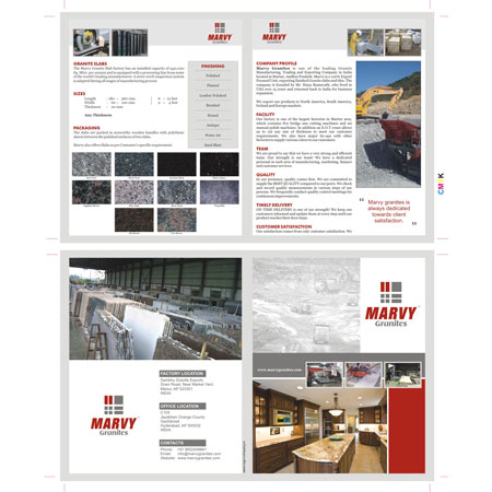
Marvy Granites
Martur, Andhra Pradesh, India
Director / Owner Info
Mr. Ramavath Hanumantha Rao
Logo Creative Concept
This logo Concept embodying Vastu principles and numerology, where seven rectangles converge. Two rectangles stand out in vibrant red, signifying energetic balance, while the remaining rectangles adopt a soothing gray tone.
The choice of seven rectangles aligns with the client's lucky numerology number. The brand name, presented in simple red and bold fonts, adds a touch of strength and clarity.
This Concept, named Vastu Harmony Seven, is tailored for a brand seeking a logo that harmonizes Vastu principles with numerological significance, creating a visually balanced and auspicious design. remove name and repetition
Logo Work Done
Logo, Stationary & Website
Logo Industry
Security Services, Consultancy

Logo Client
Prolian
New Delhi, India
Director / Owner Info
Mr. Tanish Gulati
Logo Creative Concept
In this logo Concept, the rectangular shape made with the letter 'P' and the modern fonts are elegantly presented in a rich, dark blue color palette.
The deep blue tones convey sophistication, trust, and a sense of timeless style. This color choice subtly aligns with the idea of offering high-quality and classic shirts through the online portal.
The overall design aims to create a visually appealing and subtly themed representation for an online shirt brands portal in a dark blue color scheme without explicitly stating its association
Logo Work Done
Naming , Branding, Logo Design & Stationary Design, Broucher
Logo Industry
Online Shirt Brands Portal


Logo Client
Juggernaut Shipping
Gulf Tower, Oud Metha Dubai, United Arab Emirates
Director / Owner Info
Mr. Rakesh Sharma
Logo Creative Concept
Introducing a distinctive logo Concept that merges simplicity with a touch of creativity. The logo features a vibrant blue amoeba shape, symbolizing adaptability and fluidity. Overlapping this organic form, the company initial is gracefully inscribed in white, utilizing simple yet refined fonts.
The contrast between the blue and white colors adds a crisp and clean aesthetic, enhancing visibility and readability. This Concept captures a sense of versatility and innovation.
Logo Work Done
Logo Design, Signage
Logo Industry
Juggernaut Shipping And Cargo LLC

Logo Client
Mumbai, India
Director / Owner Info
Mr. Sunil Kumar Nair
Logo Creative Concept
We crafteed a astrology-inspired logo Concept that resonates with cosmic energy. The logo unfolds against an orange circular background, symbolizing vibrancy and celestial connection.
At its core sits a mystical triangle, embodying the elements of earth, air, and fire, synonymous with astrological significance.
The company name, crafted in artistic fonts, alternates between shades of orange and black, creating a dynamic and visually engaging design. This Concept captures the essence of astrology with cosmic symbols
Logo Work Done
Logo Design & Stationary Design
Logo Industry
Multibusiness

Logo Client
Theia
Arunachal Pradesh, India
Director / Owner Info
Mr. Doni Riba
Logo Creative Concept
Introducing a logo Concept artfully designed to embody Vastu principles, featuring four rectangles in harmonious shades of red, pink, green, and blue.
Each color is strategically positioned according to compass directions, with red in the South for vitality, pink in the Southwest for relationships, green in the East for health, and blue in the North for knowledge.
Complementing this balanced arrangement is a clean and simple blue font, symbolizing reliability and professionalism
Logo Work Done
Branding, Logo Design & Stationary Design, Broucher
Logo Industry
Electrical Appliances Manufacturing Company

Logo Client
Imperial Quartz
Gujarat, India
Director / Owner Info
Mr. Aziz Theba
Logo Concept
In this Vastu-inspired logo Concept, the company initials take the form of a clock as per their work, where the letter 'Q' serves as the round face, and the letter 'I' becomes the needle pointing at the hours.
This design brings a sense of timelessness and order, aligning with Vastu principles. Additionally, a crown atop the initials adds a touch of reality and authority, symbolizing the company's prominence and strength.
Logo Work Done
Branding, Logo Design & Stationary Design, Broucher
Logo Industry
Clock Manufacturing Logo Industry

Logo Client
Vijay Seafood
Vijayawada, India
Director / Owner Info
Mr. Vijay
Logo Concept
The seafood company logo designed by us portrays a sailboat ingeniously shaped as a vibrant shrimp symbolizes sea, adventure, business and sea food.
This unique design encapsulates a nautical allure, symbolizing the adventurous spirit of the sea.
Multicolor hues within the sailboat accentuate the diverse range of seafood offerings, representing both the variety of products available and the journey through flavorful experiences.
This imaginative emblem signifies movement, freshness, and a commitment to quality in sourcing the finest seafood.
Logo Work Done
Logo, Stationary & website Design
Logo Industry
Seafood Processors and Exports
Manufacturer Exporter of Sea Fish, Frozen Fish, Fresh Fish, Sea food, indian fish, Frozen Sea Foods, Indian sea foods, Reef fishes, Katti Fish, fresh chilled fish, Pomfret Fish, Tin foil barb fish, Rohu Fish, Fresh chilled Cuttle fish, Albino fish, Seer Fish, Reef Cod Fish, Puffer fish, Cat fishes, Ribbon Fish

Logo Client
Veta Sysnet Services
Mumbai, India
Director / Owner Info
Mr. Vivek Naik
Logo Creative Concept
Introducing a vibrant logo Concept that blends simplicity and creativity. The company name is elegantly written in simple yet impactful orange fonts, signifying warmth and energy.
At the end of the name, a dynamic ball serves as the centerpiece, adorned with a playful human figure.The use of multiple colors on the ball symbolizes diversity, creativity, and a lively spirit.
This Concept communicates a sense of dynamism and inclusivity and establishes a visually engaging logo that captures the brand's energy, creativity, and diverse appeal.
Logo Work Done
Branding, Logo Design & Stationary Design, Broucher
Logo Industry
System Integration, IT Services, Telecom Partner


Logo Client
Kamya Clothing Pvt Ltd
Ahmedabad, India
Director / Owner Info
Mr. Anil Nawani
Logo Creative Concept
The logo Concept features the company's initial letter "Y," creatively designed to resemble a human figure, adding a personable touch. The dark red color palette enhances the logo's elegance and warmth.
Rectangular wings on each side of the "Y" contribute to a symmetrical composition, symbolizing a sense of uplift and progress.
This Concept aims to convey human-centric values, strength, and forward momentum, providing a distinctive and memorable representation for every customer.
Logo Work Done
Logo Design & Stationary Design
Logo Industry
Casual Shirt

Logo Client
Tulip Cotspin
Gujarat, India
Director / Owner Info
Mr. Kaushal
Logo Creative Concept
We crafted themed logo with a captivating purple background. The focal point is a pristine white "T" adorned with a flower atop its head, symbolizing growth, beauty, and a touch of nature.
The four horizontal lines beneath the letter evoke a sense of balance and stability, while the overall composition radiates elegance and tranquility.
This logo harmoniously combines the elements of nature, simplicity, and balance, creating a visually appealing and meaningful representation for your brand.
Logo Work Done
Logo Design, Stationary Design
Logo Industry
Textile Manufacturing Company

Logo Client
Mimi
Chennai
Director / Owner Info
Mr. Prabakar
Logo Creative Concept
Introducing a captivating logo Concept that combines artistic elegance with a touch of nature. The company name is presented in sophisticated, light, and rounded fonts, exuding a sense of creativity and modernity.
Playfully placed above the text is a stylized fish, symbolizing fluidity and adaptability. The color palette harmonizes with serene sky blue and rich purple hues, creating a visually pleasing contrast that represents depth and creativity.
This Concept captures a sense of artistic refinement and establishes a visually striking logo that resonates with the brand's connection to nature, innovation, and a harmonious blend of colors.
Logo Work Done
Logo Design
Logo Industry
Aquarium Manufacturing, Fish Food

.jpg)
Logo Client
Marmik Industries
Gujrat, India
Director / Owner Info
Mr. Vikram Rathor
Logo Creative Concept
We crafted this logo featuring a 3D spherical shape with a captivating ball pattern in vibrant red. Moody black fonts add depth and sophistication.
This Concept, named Dynamic Sphere Essence, is crafted for a brand seeking a logo that encapsulates dynamic energy and modernity, creating a visually compelling and memorable identity
Logo Work Done
Logo & Stationary Design
Logo Industry
Yarn and Garment Manufacturing

Logo Client
Black Swan
Dindigul
Director / Owner Info
Mr. Karthik
Logo Creative Concept
Introducing a harmonious logo Concept seamlessly blending the elegance of a swan with the grace of a lotus, all bathed in a sophisticated matte green hue.
The logo forms the shape of a swan with its graceful neck extending to create the petals of a lotus. The artistic fonts, in the same matte green, complement the organic theme, adding a touch of creativity and refinement.
Logo Work Done
Logo & Stationary Design
Logo Industry
Export & Imports


Logo Client
Mark Shipping Services
Gandhidham, Kutch, India
Director / Owner Info
Mr. Harsh A Thacker
Logo Creative Concept
Created a logo based on astrology-numerology for a shipping company, incorporating a globe and a 3D phoenix bird holding it, is a fascinating blend of symbolism.
This design harnesses the celestial power and the transformative symbolism of the phoenix. The phoenix, a symbol of rebirth and renewal, signifies resilience and adaptability, crucial traits in the shipping business.
The globe represents a global reach, aligning with the shipping industry's expansive nature.
As per clients lucky numerology there are hidden elements placed inthe logo design. For instance, the number of wing sections.
Logo Work Done
Logo & Stationary
Logo Industry
Shipping and Logistics

Logo Client
Jyoti Electrical Works
Keonjhar, Odisha
Director / Owner Info
Mr. Tanmaya Kumar Panda
Logo Creative Concept
This logo Concept features a dynamic 3D circle, symbolizing movement and innovation. Within the center of this circle, an energy sign takes prominence, representing vitality and forward momentum.
The wings extending from the circle add a sense of speed, growth, and freedom. The 3D effect creates depth, adding a modern touch to the design. The energy sign at the core signifies a powerful force or idea, radiating from the center with wings that amplify the sense of motion.
The overall composition conveys a message of progress, dynamism, and a transformative energy at the core of the brand. This logo is versatile, making it suitable for businesses that wish to portray innovation, dynamism, and a forward-thinking approach.
Logo Work Done
Logo Design
Logo Industry
Manufacturing of PCB Control Panel, Electrical Equipments
Call Ms. Vijaya
Mobile / WhatsApp: +91 - 73106 39500 (10 am to 7 pm)
*** If numbers are busy / not picked, kindly WhatsApp ***
or Email us at: imediainfotech@gmail.com
Naming + Logo Website: www.Logo-Company.in
Guru Ji's Youtube Channel
www.youtube.com/@AumSushant
Guru Aum Sushant Ji's Site
www.ShivaBlessings.com