as per Business Owners Horoscope + Numerology Analysis + Navgraha Remedies

Logo Client
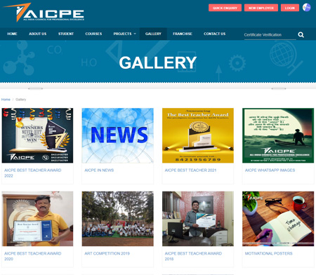
AICPE
Nagpur, India
Director / Owner Info
Mr. Sharad Taori
Logo Work Done
Logo & Stationary
Logo Concept
In this theme based logo takes flight with a metaphorical journey of personal growth.
The airplane symbolizes progress and exploration, while the human figure at its core represents the individual's aspirations and potential.
This harmonious fusion signifies a transformative journey, where personal development and the pursuit of goals soar together.
'
The design encapsulates a theme of dynamic progress and self-discovery, aligning seamlessly with the Concept of reaching new heights and embracing one's full potential.
Logo Industry
Consultancy, Education, Certification


Logo Client
Kilpauk
Director / Owner Info
Suresh Kumar
Logo Creative Concept
In this logo Concept, simplicity takes center stage with a gradient of soothing purple hues. The design exclusively features elegant fonts, placing emphasis on the first initial "Q." Within the "Q," subtle rounded stripes create a sense of movement and add a touch of modernity.
The gradient color palette exudes sophistication and depth, making the logo visually appealing and memorable. This minimalistic approach signifies a brand that values clarity and modern aesthetics, allowing the name to take prominence with a touch of subtle, stylish detailing.
Logo Work Done
Logo, Stationary & Website Design
Logo Industry
Provides services of ISO Certification

Logo Client
VEDA'International School
Bangalore
Director / Owner Info
Mr. Venkatesh Abburu
Logo Creative Concept
In this Concept, a Circular symbol of knowledge, a ball made by 2 or 3 lines, stands at the center, representing continuous learning and growth. Above this symbol, two human figures hold trophies, symbolizing academic achievement and success.
The bold rounded fonts beneath add a touch of modernity and reliability to the logo, making the brand's name prominent. The combination of the educational symbol and the celebratory trophies communicates a commitment to excellence in education.
The color palette could include warm, inviting tones to convey a positive and encouraging atmosphere within the education industry.
Logo Work Done
Logo Design
Logo Industry
International K-12 School

Logo Client
Sankalpa
Secunderabad, India
Director / Owner Info
Ms. Deepika Minocha
Logo Concept
In this logo Concept inspired by yoga, a vibrant and multicolored flower takes center stage, crafted from a harmonious arrangement of oval shapes.
The multicolored petals represent diversity and holistic well-being, while the central figure embodies the union of mind, body, and spirit, essential aspects of yoga practice.
This Concept seamlessly fuses nature-inspired elements with the practice of yoga, creating a visually captivating and meaningful logo for a brand dedicated to wellness and mindfulness.
Logo Work Done
Logo & Stationary Design
Logo Industry
Personalised Yoga Classes


Logo Client
The Athena School
Hyderabad, India
Director / Owner Info
Mr. Anoop. S. C
Logo Work Done
School Brand Launch, Name Suggestion, Tag Line Suggestion, Logo Design, School Emblem Design
Logo Industry
School, Education
Logo Creative Concept
The hidden Concepts of the Logo can be understood through the given symbol chart.
The Torch
The torch is a well known emblem of positive energy, enlightenment, warmth and hope.
A torch in held up position (vertically) symbolizes life, truth and the regenerative power of flame and is also good from Vaastu Point.
The Sword
The sword is a symbol of purification, protection, righteousness, and justice. The Sword also Symbolizes the different qualities of a student - Protection,
Courage,
Strength,
Action,
Unity,
Justice, Leadership, Decision.
The Brand Name
The Athena School
Athena - In Greek religion and mythology, Athena, is the goddess of wisdom, courage, inspiration, civilization, law and justice, just warfare, mathematics, strength, strategy, the arts, crafts, and skill.
The Slogan
"Non scholae, sed vitae discimus"
We learn not for school but for life.
Client History
The management were already running a very successful 10+2 school "SISTER STANISLAS SCHOOL" in andhra pradesh from past 35 years.
They approached us for Logo + Brand Consultancy regarding the launch of a new school with international standards.

Logo Client
HIMS
UK, India
Director / Owner Info
Dr. Mukesh Bijalwan
Logo Creative Concept
This logo Concept integrates the company initial "H" through the symbolic use of human figures forming the letter, representing unity and strength. Inside the "H," a torch with a vibrant flame emerges, signifying enlightenment, progress, and a burning passion for excellence.
The entire design is encapsulated within a shield background, emphasizing security and protection.The color scheme includes strong and bold colors such as deep blue for trust, red and orange for energy and dynamism, and silver or gray for a touch of sophistication.
This combination creates a balanced and visually striking logo,communicating a commitment to human-centric values, progress, and safeguarding ideals.
Logo Work Done
Logo Design & Stationary Design
Logo Industry
Medical College
Logo Client
Vedangas
Aurangabad, India
Director / Owner Info
Mr. Santosh Balchand Dhoot
Logo Creative Concept
Logo
Logo Work Done
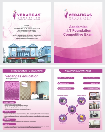
Branding, Logo Design & Stationary Design, Broucher
Logo Concept
We craft this holistic logo inspired by yoga and health, the infinity sign symbolizes the continuous flow of energy, embodying the seamless connection between mind and body. there is a human figure in a yoga pose rests upon a vibrant green flower, representing growth and vitality.
In the figure's head, a circle signifies spiritual oneness and unity. In astrology, this logo aligns with the idea of harmony and balance, mirroring the cosmic energies that influence well-being. This logo uniquely captures the essence of yoga and health brand, promising a harmonious journey toward well-being and self-discovery.
Logo Industry
Education, School

Logo Client
TQMC
Kerala
Director / Owner Info
Sarun Mani
Logo Creative Concept
This logo Concept revolves around an abstract "Q" crafted with multiple rectangles arranged in a rounded pattern. The geometric design not only adds a modern and dynamic touch but also symbolizes precision and structure.
The simplicity of the fonts complements the intricate geometric form, balancing the overall design.The color palette is kept minimalist, perhaps in neutral tones or muted shades, ensuring versatility and timeless appeal.
This logo conveys a sense of sophistication, order, and creativity, making it suitable for a brand that values precision and modern aesthetics.
Logo Work Done
Logo, Stationary & website Design
Logo Industry
TQM Certification

Logo Client
Chartered Guru
Aurangabad, India
Director / Owner Info
Mr. Sachin Loya
Logo Creative Concept
This logo Concept is a harmonious blend of the company's initials, "C" and "G," symbolizing the fusion of knowledge and growth. The outer layer, forming the letter "C," is in a calming blue color, representing stability and trust.
Nested within is the letter "G," highlighted in vibrant red, signifying passion and energy. At the core of these initials lies a chat symbol, emphasizing communication and collaborative learning.
To signify academia, a scholarly scroll hat is incorporated, adding a touch of tradition and academic excellence. The use of artistic fonts introduces a creative and dynamic element, reinforcing the brand's commitment to innovative and engaging education.
Logo Work Done
Logo & Stationary
Logo Industry
Education

Logo Client
DPS
Gujrat, India
Director / Owner Info
Mr. Vijay Pawar
Logo Concept
In this Vastu and numerology-inspired logo, a lion on a vibrant red backdrop signifies strength, while a lotus and lamp against a serene blue background symbolize purity and prosperity.
Six stars, strategically placed for balance and reflecting the significance of the number 6 in numerology, create harmony. The inclusion of a sun element, radiating energy and positivity, aligns with Vastu principles, promoting vitality and auspiciousness.
The design, emphasizing symmetry, aims to resonate with the client's vision, offering a visually striking and energetically positive logo.
Logo Work Done
School Emblem Design
Logo Industry
Education

Logo Client
Topten
Andhra Pradesh
Director / Owner Info
DR. Hemanth Kumar
Logo Creative Concept
In this creative logo Concept, the company initial "T" takes the form of a pencil, seamlessly transforming into a human figure wearing a scholar's hat. This amalgamation represents the synthesis of learning, creativity, and scholarly pursuit.
The figure, embodying the essence of education, is poised with the pencil in hand, symbolizing a continuous journey of knowledge and self-expression.
Adding a whimsical touch, a tail-like fish shape completes the logo, creating a sense of fluidity and movement. This logo Concept conveys a dynamic and artful approach to education, showcasing the brand's commitment to fostering creativity and academic excellence.
Logo Work Done
Logo & Stationary
Logo Industry
Educational Consultancy

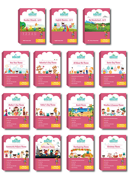
Logo Client
Eduzet
India
Director / Owner Info
M/s Eduzet
Logo creative Concept
The logo for our education-focused brand is a harmonious blend of simplicity and symbolism. The clean and modern company name is accompanied by a butterfly icon in matt green and yellow, symbolizing transformation and growth in learning.
The butterfly's wings subtly evoke open pages, emphasizing education's joy and freedom. The chosen colors create a positive and welcoming vibe, making the logo versatile for various educational materials.
This design encapsulates our commitment to providing a transformative and enriching educational experience, standing out with its minimalist yet impactful visual appeal.
Logo Work Done
Logo, Stationary & website Design
Logo Industry
Online Education

Logo Client
W.N.W
St. George Barbados
Director / Owner Info
Ms Shaquana Quintyne
Logo Creative Concept
In this logo Concept, a dynamic and skilled cricketer is portrayed in action, capturing the intensity of the game. The bold company initials are seamlessly integrated in red, symbolizing passion, energy, and the competitive spirit of cricket.
The cricketer's stance and movement evoke a sense of dynamism, highlighting the athleticism and expertise associated with the sport. This logo not only represents a commitment to cricket but also exudes strength and a bold identity for your brand.
Logo Work Done
Logo & Stationary
Logo Industry
Non- Profit Cricket Organisation

Logo Client
Indigo High School
Amritsar, India
Director / Owner Info
Ms Zoya Singh
Logo Concept
The Spiral Golden Ratio / Vastu Shashtra based logo, centered around education, features stairs symbolizing progress and growth in the learning journey.
Embracing Vastu principles, the color palette of calming earthy tones and balanced proportions is chosen to create a serene and positive atmosphere.
"Learning, Progress in Every Step" encapsulates the values of balance of Indigo education, along with steps representing teamwork, streams, and mentorship.
The stairs represent not only the physical ascent but also the intellectual and personal development fostered by education.
Logo Work Done
Logo & Stationary
Logo Industry
Education

Logo Client
Mind Power Institute
UP, India
Director / Owner Info
Mr. Rohitash Kumar Vicky
Logo Concept
In this themed logo Concept, logo seamlessly integrates the letters 'M' and 'P,' forming an elegant and unified background. Overlapping this foundation is a minimalist silhouette of a man, symbolizing human potential and progress.
Notably, a radiant dot at the mind serves as a focal point, representing enlightenment and innovative thinking. The intertwined letters emphasize collaboration and unity, while the silhouette encapsulates the essence of creativity.
The juxtaposition of a sleek design with a shining element at the core signifies the brand's commitment to forward-thinking solutions, making it a visually striking emblem for a Concept that values intellect, innovation, and interconnectedness.
Logo Work Done
Logo Design
Logo Industry
Educational
Website
www.mindpowerinstitute.com

Logo Client
Knowledge & Information Management Society
Uttar Pradesh
Director / Owner Info
Mr. Anil Singh Pundir
Logo Creative Concept
This vintage-inspired logo features an intricately designed composition with layers of circles, forming a timeless and classic backdrop. The text is elegantly arranged in a rounded pattern, adding to the vintage aesthetic.
At the heart of the design lies a scholarly touch with a scroller cap, symbolizing academia and wisdom. Surrounding the cap are delicate wheat motifs, portraying growth and abundance. In the center, a vintage-styled book adds a literary element, emphasizing the importance of knowledge.
The color palette includes muted tones such as antique gold, deep burgundy, and aged parchment to enhance the vintage feel. This logo Concept combines elements of education, tradition, and sophistication, creating a unique visual identity with a nostalgic charm.
Logo Work Done
Logo, Stationary & website Design
Logo Industry
Knowledge & Information Management Society


Logo Client
Kidsville Pre School Chain
Noida, UP, India
Director / Owner Info
Mr. Abhishek Singh
Logo Creative Concept
Logo
Logo Work Done
Illustrative Logo Design
Logo Concept
This lively logo Concept combines creativity and playful with a giraffe holding a pencil. The giraffe, known for its unique perspective, symbolizes elevated creativity, while the pencil emphasizes the brand's commitment to artistic endeavors.
Surrounding the giraffe, multi-colored crooked fonts inject a dynamic and quirky element. These fonts embody artistic freedom and a diverse range of ideas, reflecting the brand's embrace of creativity in all its forms.
The interaction between the giraffe, pencil, and crooked fonts creates a harmonious and visually intriguing composition. This logo captures the essence of artistic exploration, individuality, and a joyful approach to the creative process.
Logo Industry
Pre School Chain

Logo Client
Holy Cross Excel Academy
Guwahati, Assam
Director / Owner Info
Mr. Monojit Singha
Logo Creative Concept
We crafted a logo as a shield, this logo encapsulates the essence of safeguarding and promoting knowledge. Within the shield, four essential elements harmonize: a globe representing global awareness, a majestic lion symbolizing strength and courage in pursuit of knowledge, a scholarly cap denoting academic achievement, and a flourishing tree portraying growth and wisdom.
The simplicity of the fonts beneath the shield adds a touch of modernity, ensuring clarity and readability. The color palette, composed of deep blues, rich greens, and warm golds, radiates stability, growth, and prestige.
This Concept aspires to convey a powerful message of protection and cultivation, making it an ideal visual identity for any institution dedicated to education and knowledge.
Logo Work Done
Logo & Stationary Design
Logo Industry
Education Academy

Logo Client
Green'Field'English school
Rajasthan, India
Director / Owner Info
Green'Field'English school
Logo Creative Concept
This logo Concept is elegantly simple, featuring an opened book as the focal point, symbolizing knowledge and education. Resting atop the book is a burning torch, emanating a vibrant green flame, signifying enlightenment and the spark of learning.
The entire design is unified in a calming green color palette, reflecting growth, harmony, and a connection to nature.Complementing the imagery, straightforward and unassuming fonts are incorporated, ensuring readability and simplicity.
The combination of the book and torch in green hues creates a cohesive and visually appealing logo, embodying the idea of enlightened learning and a commitment to education.
Logo Work Done
Logo Design
Logo Industry
Education

Logo Client
Mashakio Self Defense Academy
Guwahati, Assam, India
Director / Owner Info
Mr. Suhas More
Logo Creative Concept
In this logo Concept, a circular design embraces the elegance and strength of martial arts. Within the circle, a martial artist is depicted in a poised stance, radiating expertise and discipline.
The rounded text, elegantly following the circle, enhances the sense of fluidity and continuity. The color palette includes a harmonious blend of pink, white, and black. Pink adds a touch of vibrancy and femininity, while white symbolizes purity and black signifies strength and formality.
This logo Concept combines grace and power, making it an ideal representation for a martial arts brand or academy with a unique and balanced aesthetic.
Logo Work Done
Logo, Stationary & website Design
Logo Industry
Self Defence Academy

Logo Client
Play Pen Pre School
Gujrat, India
Director / Owner Info
Mr. Prakash Patel
Logo Concept
The logo depicts a stylized representation of a house that is emblematic of safety, care, and a nurturing environment.
This symbolizes a place where early childhood development is fostered.
The use of circles to create the outline of the house suggests an approach centered around community and wholeness; each dot could be seen as an individual young learner, coming together to form a cohesive and supportive educational setting.
The typography underneath is bold and playful, imparting a sense of friendliness and accessibility. The name 'PLAY PEN' combined with 'CUM PRE SCHOOL' conveys the dual function of the institution: providing an area for play and interaction, as well as structured pre-academic readiness.
Overall, the logo signifies a welcoming space dedicated to the growth and education of children in their formative years.
Logo Work Done
Logo Design
Logo Industry
Play School Chain

Logo Client
LEA
Hyderabad, India
Director / Owner Info
Ms. Suman
Logo Concept
Based on astrological and numerological Concept -this logo features a star often represents cosmic influence, guiding energy, and individuality(based on astrology).
The number 5 (based on numerology)is also linked to curiosity and a desire for personal growth. Those with a strong presence of 5 in their numerology charts may possess a restless spirit, always on the lookout for excitement and the next challenge. A star often represents cosmic influence, guiding energy, and individuality.
Logo Work Done
Branding, Logo Design & Stationary Design, Broucher
Logo Industry
Life Skills Training, Coaching

Logo Client
Nursery Champs
Delhi, India
Director / Owner Info
Mr. Sanjeev Goel
Logo Concept
In this vibrant and playful logo Concept, two joyful kids take center stage, exuding the essence of youthful energy and camaraderie.
Above them, a symbolic sun radiates warmth and positivity, adding a touch of whimsy to the design.
The use of multicolor fonts enhances the visual appeal, creating an engaging and lively atmosphere.
This themed logo Concept is crafted to evoke a sense of fun and creativity, making it an ideal representation for a brand focused on children and their playful adventures.
Logo Work Done
Logo
Logo Industry
Pre School Chain

Logo Client
Kidz Medha School
Hyderabad
Director / Owner Info
Mr. Anjan Kumar
Logo Creative Concept
This logo Concept envisions a harmonious and vibrant representation of wellness. Enclosed within a circular frame created by interconnecting beads in red, blue, and yellow, a central human figure stands gracefully.
The figure is accentuated by a base resembling the sun, symbolizing energy and vitality. Above the figure, a stylized flame represents the transformative power and passion for well-being.
The color palette includes red for energy, blue for tranquility, and yellow for positivity, creating a balanced and visually stimulating design. This logo embodies the holistic nature of wellness, radiating warmth and vibrancy, making it a captivating visual identity for a brand focused on health and vitality.
Logo Work Done
Logo & Stationary Design
Logo Industry
Education

Logo Client
Radient
Delhi, India
Director / Owner Info
Mr. Sanjeev Goel
Logo Creative Concept
This logo Concept features a rounded background in a serene blue color, symbolizing trust and tranquility. At the center is a bold company initial in vibrant red, forming an upward arrow shape.
This design not only signifies progress and forward momentum but also conveys a sense of elevation and growth. The red color adds a dynamic and attention-grabbing element, while the overall simplicity ensures clarity and versatility.
The combination of blue and red creates a visually appealing contrast, making this logo an impactful representation for a brand focused on upward movement and advancement.
Logo Work Done
Logo
Logo Industry
Pre School Chain

Logo Client
Weehive Juniors
Bangalore, India
Director / Owner Info
Ms. Lakshmi Narayanan
Logo Creative Concept
This logo Concept incorporates the charm of nature with four stylized bees surrounding a circle, forming a cohesive beehive. The bees symbolize community, cooperation, and industriousness, while the circular hive represents unity and harmony. Within the hive, artistic fonts elegantly spell out the company name, adding a touch of creativity and individuality.
The color palette may include warm yellows and browns, creating a friendly and inviting atmosphere. This Concept aims to convey a sense of teamwork, collaboration, and nature-inspired elegance, making it a distinctive and memorable logo for a brand associated with community or productivity.
Logo Work Done
Branding, Logo Design & Stationary Design
Logo Industry
Education, School
Call Ms. Vijaya
Mobile / WhatsApp: +91 - 73106 39500 (10 am to 7 pm)
*** If numbers are busy / not picked, kindly WhatsApp ***
or Email us at: imediainfotech@gmail.com
Naming + Logo Website: www.Logo-Company.in
Guru Ji's Youtube Channel
www.youtube.com/@AumSushant
Guru Aum Sushant Ji's Site
www.ShivaBlessings.com