as per Business Owners Horoscope + Numerology Analysis + Navgraha Remedies


Logo Client
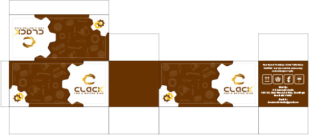
Clack
New Delhi
Director / Owner Info
Shamshad Hussain Ansari
Logo Concept
The logo concept offers Energy to symbolize cosmic nourishment, adds a unique and meaningful touch to the design. The incorporation of a crown with two horns to represent astrological dualities is a clever and visually striking element.
The color palette of deep purple and gold further enhances the cosmic theme and adds a sense of luxury and mystique to the logo.This astrology-inspired logo Concept effectively captures themes of abundance, mysticism, and celestial dualities in a concise and symbolic manner.
It would likely resonate well with individuals interested in astrology and cosmic symbolism, making it a memorable and impactful visual representation for the brand it represents.
Logo Work Done
Logo & Stationary Design
Logo Industry
Battery Business


Logo Client
Geelani International
Kashmir
Director / Owner Info
Zaid Bin Nazir
Logo Concept
The logo features a stylized dry season leaf with intricate veins, forming the shape of the letter "G" subtly within the leaf's structure.
The leaf is designed with warm, earthy tones to represent the dry season theme. The fonts used for the company initials "G" are sleek and modern, adding a contemporary touch to the design.
Logo Work Done
Logo & Stationary
Logo Industry
Export of Food, Fashion and Handicrafts

Logo Client
Dev Bhoomi Properties
Noida, India
Director / Owner Info
Mr. Nandan Negi
Logo Concept
This logo Concept seamlessly merges the letters 'D' and 'B,' symbolizing the unity and collaboration and name of the brand. Surrounding this central motif is a circular arrangement of buildings, this architectural embrace conveys a sense of security, stability, and community'an inviting space where ideas and people converge.
The choice of colors can further enhance the Concept, with warm tones fostering a sense of community and approachability, while cooler tones convey professionalism and modernity.
In essence, this logo embodies a brand identity that values unity, collaboration, and the inclusive environment it provides for diverse elements to thrive together, forming a cohesive and welcoming space.
Logo Work Done
Logo Design, Website Design
Logo Industry
Real Estate, Property, Commercial Leasing

Logo Client
Jainam Fashion
Bhilwara, Rajasthan, India
Director / Owner Info
Mr. Archit Jain
Logo Creative Concept
The logo Concept features a dynamic arrangement of simple upward curved lines in multiple colors, symbolizing diversity and growth. The interweaving lines represent the interconnectedness of various elements, creating a sense of unity and harmony.
A vibrant purple sphere adds a focal point, signifying wholeness and infinite possibilities. The use of multiple colors within the curved lines reflects a spectrum of emotions and experiences, showcasing the richness of the human journey.
The modern and sleek font in an energizing orange color complements the design, adding a touch of vibrancy and sophistication to the overall visual identity.
Logo Work Done
Logo Design
Logo Industry
Fashion, Garment Export, Textile Mill

Logo Client
Proxima
Nehru Place,
India
Director / Owner Info
Ms. Anita Chopra
Logo Creative Concept
The logo Concept features a dynamic arrangement of simple upward curved lines in multiple colors, symbolizing diversity and growth. The interweaving lines represent the interconnectedness of various elements, creating a sense of unity and harmony.
A vibrant purple sphere adds a focal point, signifying wholeness and infinite possibilities. The use of multiple colors within the curved lines reflects a spectrum of emotions and experiences, showcasing the richness of the human journey.
The modern and sleek font in an energizing orange color complements the design, adding a touch of vibrancy and sophistication to the overall visual identity.
Logo Work Done
Logo & Stationary Design
Logo Industry
Health Care


Logo Client
Rapiddx Technologies
Bangalore, Karnataka, India
Director / Owner Info
Mr. Satish Dnyanoba Kalme
Logo Creative Concept
The logo consists of six dots arranged in a triangular formation, symbolizing connectivity, unity, and strength. The dots are shaded in varying tones of purple, creating depth and visual interest. The triangular shape formed by the dots suggests stability and progression.
The company name or initials are displayed in bold, modern fonts, with the primary color being purple and accents in blue. The contrast between the purple and blue adds vibrancy to the design while maintaining a cohesive color scheme
Logo Work Done
Logo & Stationary Design
Logo Industry
Mechatronics, Microfluidics, and Data Analytics


Logo Client
Sun Plastics
Gaborone, Botswana
Director / Owner Info
Mr. Raj Patel
Logo Creative Concept
A sleek "S" intertwines with two arrows, embodying movement and balance, inspired by theclient's lucky number.
Vibrant orange hues symbolize energy and creativity, while light blue fonts exude trust and professionalism. This logo captures dynamism and harmony, reflecting the essence of the company's identity
Logo Work Done
Logo, Stationary & website Design
Logo Industry
Plastic


Logo Client
Tarot Luck by Rupa
UK, India
Director / Owner Info
Mrs. Rupa
Logo Concept
This astrology based logo for a renowned Tarot Card Reader, the logo features a radiant sun at the center, symbolizing enlightenment and positivity in tarot consultations, representing both Masculine & Feminine powers, also Major and Minor Arcana Decks.
Adjacent to the sun is a crescent moon, embodying intuition, mystery, and the exploration of the unconscious aspects inherent in tarot readings. Scattered stars twinkle in the celestial backdrop, representing the cosmic energies that influence and shape tarot insights.
Completing the scene, a gentle layer of ocean waves at the bottom introduces notions of depth, fluidity, and the connection to vast and intuitive realms. Readings involve shuffling and drawing cards to interpret their meanings in a spread, offering insights into past, present, or future situations.
In totality, this logo serves as a visual gateway to the mystical realms explored in tarot consultation - Interpretations combine symbolism, intuition, and personal connection to provide guidance and reflection, rather than deterministic predictions.
Logo Work Done
Logo, Stationary & website Design
Logo Industry
Taro Consultant

Logo Client
Saavika
Gomti Nagar, Lucknow, India
Director / Owner Info
Mr. Kaushal Kishore
Logo Concept
In this mixture of Vastu and numerology principles, the design unfolds with two semicircles and two semi-cylinders artfully arranged to form a square.
This geometric configuration symbolizes stability and balance in accordance with Vastu principles, imparting a strong foundation to the visual identity.
Each semicircle and semi-cylinder is assigned a representation,with one semicircle embodying the essence of training, another encapsulating the spirit of consultation, and the semi-cylinders serving as symbols for technology and innovation.
The open center within the square formation not only introduces a touch of openness but also symbolizes receptivity to new ideas and technologies.
Directional placement aligns with Vastu principles, potentially positioning the square in the northeast to enhance positive energy flow and cultivate an environment conducive to learning.
The lines and curves within the design create a harmonious flow, representing the seamless integration of IT training and consultation.
Logo Work Done
Logo & Stationary Design
Logo Industry
IT market-Training and Consultation

Logo Client
Fairlead
Gujarat
Director / Owner Info
Mr. SVR Krishna
Logo Concept
The smartly design logo follows - Less is More approach - minimalism with organic green hue. The sleek typography incorporated a subtle wing-shaped 'e,' symbolizing elevation, growth, movement and progress.
Also the green color symbolized planet Mercury 'Budh'; which covers communication skills, intelligence, oratory skills, intellect, trade, commerce, and business'acumen.
Logo Work Done
Logo & Stationary Design
Logo Industry
Testing, Inspection & Certification agency

Logo Client
Smirom
Surat, Gujrat, India
Director / Owner Info
Ms. Mayenka Guptaa
Logo Concept
A vibrant ball-like shape composed of multiple colorful dots radiates energy and diversity. Bold blue fonts complement the kaleidoscope of hues, embodying simplicity and strength. This logo captures the essence of dynamic inclusivity and modernity.
Logo Work Done
Logo & Stationary Design
Logo Industry
Packaging Logo Industry

Logo Client
MASS
Delta, BC V4G 0A4, Canada
Director / Owner Info
Muny Sidhu
Logo Concept
In this minimalistic futuristic logo Concept, the abstract 'M' is crafted with an intricate arrangement of triangles / squares with blending shades of red, orange, and yellow. Each triangle represents 'energy, direction & versatility' and the squares represent balance and stability within the company, while the warm color palette suggests dynamism and creativity.
The intentional arrangement of squares forms a cohesive and visually appealing initial, reflecting the brand's commitment to unity amid diversity. The simplicity of the design ensures clarity and memorability, making it a distinctive and adaptable logo for the brand.
Logo Work Done
Logo
Logo Industry
Strategic Corporate Advisory Capital Raising Execution

Logo Client
Loyto
Purba Bardhaman
Director / Owner Info
Bappa Das
Logo Concept
vivid green text positioned against a pure white design, creating a visually appealing contrast that draws the viewer's attention immediately.
The text itself is complemented by the presence of a square shape, which is mentioned twice, suggesting either a repetition or a significant emphasis on geometric simplicity within the design.
This combination of text and geometric shape hints at a logo or a symbol, designed with a clear intention to communicate a specific identity or message.
The use of green in the text is not arbitrary; it could signify growth, environmental consciousness, or a fresh start, depending on the context of the logo.
This color choice is accentuated by an accent color that further defines the visual identity of the logo, without overpowering the primary message conveyed by the green text.
Logo Work Done
Naming, Logo Design & Stationary Design
Logo Industry
Led Lights Manufacturer

.jpg)
.jpg)
Logo Client
Zomak
Kota, Rajsthan, India
Director / Owner Info
Mr. Akshay Goswami
Logo Concept
The logo features a simple company name with the letter "O" replaced by a globe, symbolizing global presence and connectivity. Three upward-rising arrows within the globe represent the client's lucky numerological number, 3, signifying growth and expansion.
Logo Work Done
Logo & Stationary Design
Logo Industry
Academic Writing

Logo Client
Varjish Must
Patiala, India
Director / Owner Info
Mr. Kamal Kaushik
Logo Concept
The dynamic logo Concept ,features a strong and formidable human figure formed by a distinctive V shape. The figure embodies the essence of strength, power, and athleticism, reflecting the core values of the fitness and gym. The arms are intentionally designed to evoke the image of a wrestler, emphasizing resilience and determination.
With a focused expression, the head of the figure signifies mental strength and discipline, essential components of any successful fitness journey. The overall shape creates a sense of forward momentum, symbolizing progress and personal growth through physical fitness.
The chosen color palette, perhaps bold and energetic tones like red or black, adds a sense of vibrancy and intensity to the logo, aligning with the vigor associated with gym workouts.
Logo Work Done
Logo & Stationary
Logo Industry
Gym

Logo Client
Aarna Financial Services
Ahmedabad'
Director / Owner Info
Mr. Ranjeet Kumar Shrivastava and Mr. Jay Ghanshyambhai Patel
Logo Creative Concept
The logo we designed featured a pyramid-style abstract 'A' symbolizing stability and growth, reflecting the solid foundation crucial in financial strategies.
Harmonizing colors like green for prosperity and stability, alongside blue for trust and reliability, this emblem signifies a balanced approach to wealth management, aligning with Feng Shui's principles of prosperity and harmony in financial planning.
Logo Work Done
Logo & Stationary
Logo Industry
Financial Planning, Risk Planning, Tax Planning

Logo Client
Weehive Juniors
Bangalore, India
Director / Owner Info
Ms. Lakshmi Narayanan
Logo Creative Concept
This logo Concept incorporates the charm of nature with four stylized bees surrounding a circle, forming a cohesive beehive. The bees symbolize community, cooperation, and industriousness, while the circular hive represents unity and harmony. Within the hive, artistic fonts elegantly spell out the company name, adding a touch of creativity and individuality.
The color palette may include warm yellows and browns, creating a friendly and inviting atmosphere. This Concept aims to convey a sense of teamwork, collaboration, and nature-inspired elegance, making it a distinctive and memorable logo for a brand associated with community or productivity.
Logo Work Done
Branding, Logo Design & Stationary Design
Logo Industry
Education, School

.jpg)
Logo Client
Jubliee Ply
Bangalore
Director / Owner Info
Mr. Pratik Poddar
Logo Creative Concept
A red dot, symbolizing focus and unity, is embraced by two mirrored triangles in black and red, representing balance and symmetry. Rounded fonts in black and red complete the design, conveying modernity and cohesion.
Logo Work Done
Logo, Stationary & website Design
Logo Industry
Plywood

Logo Client
Mufies
Maharashtra, India
Director / Owner Info
Mr. Mufassir Siraj
Logo Concept
We crafted a logo as per Vastu principles, the logo is thoughtfully crafted to foster harmony and positive energy. Against a stabilizing black background, the vibrant interplay of yellow and red fonts symbolizes passion and energy.
Positioned at the logo's center, a green chilli, and two leaves one in sunny yellow and the other in fresh green, evoke a sense of balance and growth.
The circular or square shape embodies completeness, while directional considerations align the central elements with the auspicious north or east.
This design not only embraces Vastu's core tenets of balance and positive energy but also reflects the restaurant's essence with clarity and simplicity, offering a visually pleasing and harmonious representation.
Logo Work Done
Logo Design
Logo Industry
Restaurant Chain

Logo Client
Les fiesta
Bangalore, India
Director / Owner Info
Mr. Prashanth Srinivas Murthy
Logo Concept
Embodying a rich and elegant theme, this logo unfolds against a backdrop of royal purple. At its center, three gracefully poised spoons symbolize collaboration and unity, and dynamic black, oranges,and red for fire, evoke a sense of movement and passion.
The company name, in yellow and orange at the bottom, anchors the design with a touch of modernity.
Together, these elements encapsulate the essence of the brand, seamlessly blending creativity, adaptability, and energy in a visually captivating composition.
Logo Work Done
Branding, Logo Design & Stationary Design, Broucher
Logo Industry
Restaurant Chain

Logo Client
Home Life Interiors
Assam, India
Director / Owner Info
M/S Home Life Interiors
Logo Concept
In this typographical logo Concept, the intertwining H and L form a harmonious unity, symbolizing the company initials, both rendered in a luxurious golden hue. This seamless integration conveys collaboration and synergy.
At the center, a stylized human figure emerges, signifying the human touch and personal connection within the brand. Against a green rectangular background, the golden elements pop, creating a visually striking contrast. The color palette exudes a sense of growth, vitality, and prosperity.
Logo Work Done
Branding, Logo Design & Stationary Design, Broucher
Logo Industry
Interiors Design, Home Decor

Logo Client
Rayainox
Maharashtra, India
Director / Owner Info
Mr. Ravi Yawalkar
Logo Concept
The logo inspired by the Bazi chart. A central rectangle, adorned in calming blue, signifies stability. Positioned above, a smaller rectangle in silver represents wisdom and adaptability. Below, a subtle sky-blue rectangle symbolizes growth and opportunity.
This design aligns with the elements of the Bazi chart. The geometric harmony of rectangles mirrors the balance sought in Bazi, offering a visually meaningful logo for your business.
Logo Work Done
Logo, Stationary & website Design
Logo Industry
designer colored stainless steel sheets

Logo Client
Sankalpa
Secunderabad, India
Director / Owner Info
Ms. Deepika Minocha
Logo Work Done
Logo & Stationary Design
Logo Concept
In this logo Concept inspired by yoga, a vibrant and multicolored flower takes center stage, crafted from a harmonious arrangement of oval shapes.
The multicolored petals represent diversity and holistic well-being, while the central figure embodies the union of mind, body, and spirit, essential aspects of yoga practice.
This Concept seamlessly fuses nature-inspired elements with the practice of yoga, creating a visually captivating and meaningful logo for a brand dedicated to wellness and mindfulness.
Logo Industry
Personalised Yoga Classes


Logo Client
Lakshmi Lifecare
Hingoli, India
Director / Owner Info
Dr. Akhil Ashok Agrawal
Logo Concept
In this logo Concept, a dynamic pulse symbol is ingeniously crafted to resemble two human figures, symbolizing unity and synergy.
The combination of blue and green hues adds depth and vitality to the design, evoking a sense of harmony and balance. Accompanied by sleek blue fonts, the logo captures attention while conveying a message of interconnectedness and collaboration.
Logo Work Done
Logo & Stationary Design
Logo Industry
Hospital

Logo Client
Vetasysnet Services
Mumbai, India
Director / Owner Info
Mr. Vivek Naik
Logo Concept
In this astrologically inspired logo, orange color in Veta, representing energy and vitality. At the end of the name, a spherical element emerges, symbolizing harmony and balance in alignment with Vastu principles.
Within this sphere is a meticulously drawn human figure, resonating with the energies of the Vastu Purusha. The ball itself is adorned with four distinct colors, each representing the essential elements of earth, water, fire, and air. This vibrant and balanced composition not only echoes the principles of Vastu Shastra.
Logo Work Done
Branding, Logo Design & Stationary Design, Broucher
Logo Industry
System integration, IT Services, Telecom partner

Logo Client
Srijan's Life Sciences
Jharkhand, India
Director / Owner Info
Dr. Himanshu Roy
Logo Concept
In this logo Concept, the company name takes on a symbolic representation. The letters 'I' and 'J' transform into an abstract figure resembling a male and female, with a child at the center.
This subtle visual metaphor alludes to the core theme of IVF and child fertility. The use of red and blue colors adds emotional depth, representing warmth, love, and the professional care associated with the industry.
Logo Work Done
Branding, Logo Design & Stationary Design, Broucher
Logo Industry
IVF Child Fertility


Logo Client
KC Jewellers
Jamshedpur, India
Director / Owner Info
Mr. Siddharth Adeshra
Logo Work Done
Logo & Stationary Design
Logo Creative Concept
The Concept can be inspired by elegance, beauty, and purity associated with the lotus flower. The lotus petals symbolize grace, sophistication, and luxury, aligning well with the high-end nature of a jewelry showroom.
The design could incorporate the lotus petals in a stylized and artistic manner, creating a sense of delicacy and refinement. The use of soft, pastel colors like pink, white, or gold can enhance the luxurious feel of the logo.
The petals can be arranged in a circular or radial pattern to mimic the shape of a blooming lotus flower, symbolizing growth and prosperity. Beside the lotus petals, the name of the showroom can be elegantly integrated using a sophisticated and modern font.
Logo Industry
Jwellery Showroom
Logo Client
Purple You
Arunachal Pradesh, India
Director / Owner Info
Mr. Doni Riba
Logo Concept
In this logo Concept, the company initial 'P' takes center stage with multicolored "hairs" at its head. This playful element subtly alludes to the diversity and innovation within the realm of electrical appliances, particularly TVs.
The modern fonts add a contemporary touch, representing cutting-edge technology. The overall design aims to create a visually engaging and meaningful representation without explicitly stating its connection to electrical appliances manufacturing.
Logo Work Done
Branding, Logo Design & Stationary Design, Broucher
Logo Industry
Electrical Appliances manufacturing Company

Logo Client
Massimo
Mumbai, India
Director / Owner Info
Mr. Riaz Badamia
Logo Concept
A regal "M" crafted in lustrous golden hues, adorned with a majestic crown atop and a ribbon gracefully intertwined. Bold, artistic golden fonts complement the design, exuding elegance and distinction.
Logo Work Done
Branding & Logo Design
Logo Industry
Shoe, Footwear Logo Industry

.jpg)
Logo Client
Shankar Bhavan
Odisha, India
Director / Owner Info
Ms. Vinayak Subudhi
Logo Concept
The logo Concept features a minimalist design with rounded lines and a light brown color palette. The initial "S" represents the company's identity, embodying simplicity and sophistication. Inspired by music, the design elements evoke rhythm and harmony. Light brown fonts add organic charm, creating a timeless and artistic aesthetic
Logo Work Done
Branding & Logo Design
Logo Industry
Business Hotel
Call Ms. Vijaya
Mobile / WhatsApp: +91-73106 39500 (10 AM ' 7 PM)
If busy, kindly send a WhatsApp message.
?? Email: imediainfotech@gmail.com
?? Visit: www.Logo-Company.in
?? YouTube Channel: Aum Sushant
?? Website: www.ShivaBlessings.com