
Logo Client
Sisnet Spectrum Network
Kulalampur, Malaysia
Director / Owner Info
Mr. Vikneswaran
Logo Creative Concept
Needed a Corporate Brand Logo for an ITes Company with lots of strict Technical Guidelines as per Vaastu and Numerology Directions. It was one of my toughest logo in terms of execution and idea.
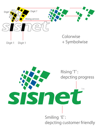
The unique symbol has an electronic board, the digital grid, the network mesh with hidden digits '1' '1' and digit '7' '7' concealed. The Squares in a unique symbolic forms a Business Network, A Data Network. The symbol depicts sisnet as a solution provider to various business.
The Square Grid shows sisnet as a Foundation, Protector, Enabler, Community, Direction, Stabilizing, Dependable. The symbolic squares also depicts Office Setups in GRID Form, the desks, the pcs, the laptops, the people.
Vastu / Numerology Guidelines
1. Must NOT be in red, black, purple or pink. Can be in technical (blue) or trendy (green).
2. No very sharp alphabet edges or in cursive manner.
3. Numerical digit '1' '1' / '7' '7' should be incorporated in hidden manner which can only be noticed if observed in detail or a Pyramid like letters or shape or vectors incorporated.
4. Logo design/letters/alphabet should be branding in nature so as to have subliminal effect on viewers.
5. Logo should reflect that the company is reliable, capable, successful and carrier class company.
6. Logo should be balanced as much, by keeping the "weight" of the graphics, colors, and size equal on each side.
7. The logo must also look good in black and white, grayscale, and two colors.
8. Make sure the font is legible when scaled down, especially with script fonts.
Logo Work Done
Vaastu - Feng Shui - Astrology Based Logo Design
Logo Industry
Telecom
Logo Client
Andaman Airways (P) Ltd
Andaman / Mumbai, India
Logo Industry
Air Services, Air Transport Services (both scheduled and non scheduled , operations in regional, domestic and international sectors, both passengers and cargo).
Logo Creative Concept
Logo was made around the tagline "the wings of the islands". The logo symbol is made as a tail/wing shape with multiple dots representing multiple islands of Andaman, as tourist use their service to travel from one island to another.
The logo has shades of blue color to associate with clarity, water, dreams.
Director / Owner Info
Ms. Rubina Siddiqui
Logo Work Done
Logo Design
Logo Client
Doorva International
Lucknow, Uttarpradesh
Director / Owner Info
Mr. Arvind Agarwal
Logo Creative Concept
Doorva is a Sanskrit word which means grass a special type of grass which is very soft in nature, and the smallest thing which signifies humbleness, survival capacity (tendency to regain its position after being trampled).
Above all it is most essential for the worship of lord Ganesha, without it one can't complete the worship of lord Ganesha, Without worship of Lord Ganesha one can not Start any good work or Anusthan. It was a wish that we would build a institute which became essential for everyone who is related to this trade.
The logo is designed with a 3D feel combining human, star, grass, trunk of Ganesha, with eye pleasing colors.
Logo Work Done
Logo Design & Stationary Design
Logo Industry
Radiology and pathology products, which helps to perform X ray and clinical test of a patient. Doorva international is situated in lucknow performing since last 17 years.
Working in more than ¼ of nation with high standards of business ethics we are purely in distribution of products.

Logo Client
Delhi Cancer Clinic
New Delhi, India
Director / Owner Info
Dr. Shubham Garg
Logo Creative Concept
The logo is designed using lucky astrology Numerology colors and curvy shapes as two curves symbolize D and C of company initials of "Delhi Cancer Clinic".
Subconsciously the overlapping / Venn diagram gives a feel of DNA, body cells and targeted solutions.
Logo Work Done
Logo Design & Stationary Design
Logo Industry
Cancer Treatment, Cancer Hospital, suggesting solutions by Surgery,
Radiation Therapy,
Chemotherapy,
Immunotherapy,
Targeted Therapy,
Hormone Therapy,
Stem Cell Transplant,
Precision Medicine
Logo Client
Vulcan
Tamilnadu, India
Director / Owner Info
Mr. K Vasudevan
Logo Creative Concept
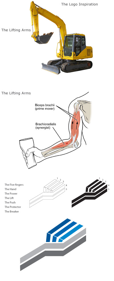
The company was looking for a unique Modern Bold Corporate Logo. After signup several day passed, liters of coffee gulped, cheese burst consumed and nothing exciting came up during the 3 day sketching session.
Then suddenly an idea sparked, while I was visiting my friend in his GYM session. The innovative idea which is shown in the diagram was approved and finalize immediately by the client in single go. It was like love at the first sight.
The logo symbolizes - the arms of the crane, the rock breaker, the earthmover the inventions inspired by the power of Human Arms
- The Breaker
- The Protector
- The Push
- The Lift
- The Power
- The Hand
- The Five fingers
Logo Work Done
Logo Design, Website Design, Corporate Email Solution
Logo Industry
Earthmover Machines, Mining Equipment, Cranes, Rock Breaker
Logo Client
Archimedes
India
Director / Owner Info
Mr. Vijay Perumal
Logo Concept
The logo features a windmill designed as a symbol of renewable energy and eco-friendliness, with blades shaped like flower petals or a pinwheel.
The color palette reflects innovation, cooler world reducing green house global warming and sustainability. A modern, clean font is used for the company name to convey professionalism and innovation. The layout is balanced, with the windmill as the corporate brand icon - as a focal point and the flowers/pinwheel design prominently featured as fun, playful innocent, innovation, friendly.
The overall design is playful yet professional, and conveys the company's commitment to sustainable energy in a friendly and approachable manner.
Logo Work Done
Logo Design
Logo Industry
Wind energy, Clean Energy

Logo Client
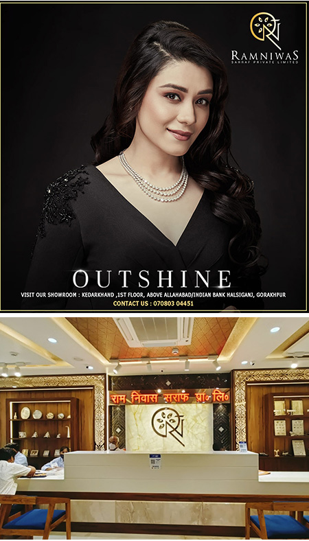
Ramniwas Sarraf Private Limited
Gorakhpur, India
Director / Owner Info
Mr.Vikas Sarraff
Logo Concept
Crafted under celestial influences, the jewelry logo intertwines the company initials 'RN' with the celestial sun (God of Gold) and 5 lucky elements as petal motif along with abstract hidden Indian rupee symbol.
Infused with astrological brilliance of Surya Graha, this emblem symbolizes cosmic beauty and radiance, reflecting our commitment to offering jewelry that illuminates personal style while embracing cosmic connections.
Logo Work Done
Logo Design, Branding
Logo Industry
Jewellery
.jpg)
Logo Client
Bran-O
Mumbai
Director / Owner Info
Mr. Kunal Batra
Logo Concept
Harmoniously integrated typography based logo.
The selected font, balancing rustic charm with modernity, reflects the natural and wholesome quality inherent in baked goods.
A creative touch is added to the letter "R" in where it takes the form of a raw wheat stem extending upwards. This visual element not only links the company's name with its primary ingredient but also symbolizes the foundational nature of wheat in its products.
With a brief tagline beneath the logo, emphasizing the company's commitment to healthy and nutritious offerings, this logo narrates a story of tradition, craftsmanship, and a dedication to quality in Gomti Healthy Nutrients Private Limited's line of bread and baked goods.
Logo Work Done
Logo Design & Stationary Design
Logo Industry
Bread & baked goods manufacturing company
.jpg)
.jpg)
Logo Client
AMISI
New Delhi, India
Director / Owner Info
Mr. B Chowdhury
Logo Concept
In this logo Concept, a rounded design, featuring the company initial gracefully placed at the center. The entire emblem radiates in a luxurious golden color, complemented by matching golden fonts.
This Concept, named Golden Elegance Emblem, is crafted for a brand seeking a logo that exudes opulence and sophistication, creating a visually captivating and refined identity.
Logo Work Done
Logo Design, Packaging
Logo Industry
Facial Tissue Paper

Logo Client
Hycare
J&K, India
Director / Owner Info
Mr. Shabir Ahmad Dar
Logo Concept
In this logo Concept, the company name features a plus sign integrated into the simple, bold white fonts. The entire design is encapsulated within an oval shape, set against a soothing blue backdrop.
This Concept, is tailored for a brand seeking a logo that seamlessly combines health elements with a clean and visually appealing design, creating a memorable and harmonious visual identity.
Logo Work Done
Logo Design,Stationary
Logo Industry
Hycare Products
Logo Client
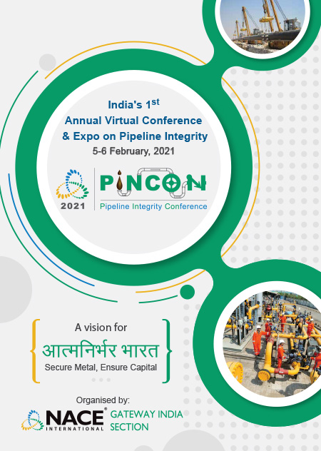
Pincon
Director / Owner Info
Pincon
Logo Concept
The logo Concept visually striking and well-thought-out design. By incorporating a plus sign into the company name and using simple, bold white fonts, the logo effectively communicates a message of health and positivity.
The choice of an oval shape and a soothing blue backdrop adds a sense of calmness and professionalism to the overall design. This Concept is ideal for a brand looking to convey a message of health and harmony in a visually appealing way.
Logo Work Done
Website, Broacher & Emailers Design
Logo Industry
Industrial Event & Promotion

Logo Client
Bakasur Bandi
Bangalore, India
Director / Owner Info
Mr. Prashanth Srinivas Murthy
Logo Concept
This astrology-inspired logo features Bakasur in regal purple attire, holding and offering food to signify cosmic nourishment and life's cyclical nature. The crown with two horns represents astrological dualities.
The color palette, including deep purple and gold, underscores the cosmic significance. This concise and symbolic design uniquely captures astrological themes of abundance, mysticism, and celestial dualities.
Logo Work Done
Branding, Logo Design & Stationary Design, Broucher
Logo Industry
Restaurant Chain
Logo Client
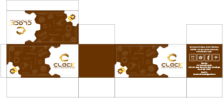
Clack
New Delhi
Director / Owner Info
Shamshad Hussain Ansari
Logo Concept
The logo concept offers Energy to symbolize cosmic nourishment, adds a unique and meaningful touch to the design. The incorporation of a crown with two horns to represent astrological dualities is a clever and visually striking element.
The color palette of deep purple and gold further enhances the cosmic theme and adds a sense of luxury and mystique to the logo. This astrology-inspired logo Concept effectively captures themes of abundance, mysticism, and celestial dualities in a concise and symbolic manner.
It would likely resonate well with individuals interested in astrology and cosmic symbolism, making it a memorable and impactful visual representation for the brand it represents
Logo Work Done
Logo & Stationary Design
Logo Industry
Battery Business
Logo Client
Mera Pump /
Sagnik
Bangalore, India
Director / Owner Info
Sagnik Fuel Chain Pvt. Ltd
Logo Concept
In this theme based logo, the strong lines at its core symbolizes reliability and efficiency on the logo. Picture the tricolor radiating a sense of national pride, while the tire underscores the robust and dependable nature of our service.
It's more than just a logo; it's a visual promise of timely and efficient fuel delivery to your doorstep. Drive forward with confidence, as our emblem echoes the colors of the nation and the strength of our commitment to your fuel needs.
Logo Work Done
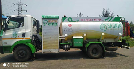
Theme based Logo design as per Lucky Elements & Numerology, Branding, Presentations, Digital Media & Truck Design
Logo Industry
Doorstep Fuel Delivery Service Company Startup
© iMedia Ad Agency
www.logo-company.in
~Guru Aum Sushant Ji's Spiritual Website~
www.ShivaBlessings.com
(Business Astrology Numerology Vaastu Gemstones Rudraksha Yantras)