We design PREMIUM Logos which you can Trademark © ® ™
Logo designer, Logo Company, Logo Maker
Top famous logos in the World
and their successful case study

A great logo can make or break a brand. It's the first thing that catches our eye, the symbol that represents a company's values, and the foundation of a brand's identity. Some logos are so iconic that they have become ingrained in our culture and have even achieved a cult-like following.


From the golden arches of McDonald's to the interlocking circles of Audi, each of these logos has a unique story and design philosophy behind it. Some have evolved over time, while others have remained virtually unchanged for decades.


Here's a brief overview of logo and symbol use throughout history, including prehistoric, ancient, and medieval periods:?


Prehistoric (Before 3000 BCE):

Cave Paintings:
Early humans created symbolic markings in caves, such as those found in the Lascaux caves in France, which could be considered early forms of visual communication and symbolic representation.


Ancient Civilizations (3000 BCE - 500 CE):

Sumerian Seals:
Sumerians used cylinder seals to imprint designs onto clay tablets, serving as a form of signature or mark of ownership.

Egyptian Hieroglyphs:
Ancient Egyptians used hieroglyphs as symbolic representations of objects, ideas, and sounds, which could be considered a form of visual communication akin to logos.


Roman Standards:
Romans used military standards (signum) as symbols of identity and allegiance, often featuring emblems and symbols representing their legion or cohort.


Medieval Period (500 CE - 1500 CE):

Heraldry:
Heraldry became prominent in medieval Europe, with coats of arms serving as symbols of noble families, kingdoms, and organizations. These symbols were displayed on shields, banners, and clothing.


Guild Marks:
Medieval guilds used marks or symbols to identify their members and products. These marks often included symbols related to the guild's trade or craft.

Monograms:
Monograms, or stylized initials, were used as personal or royal symbols. For example, Charlemagne used a monogram of the letters "K" and "R" (Karolus Rex) to represent his name.


Early Modern Period (1500 CE - 1800 CE):

Watermarks:
Watermarks were used in papermaking as a form of identification and branding. These marks often included symbols, initials, or images.
Printer's Marks: Printers in the early modern period used printer's marks or devices as logos to identify their work and distinguish it from others.


Industrial Revolution (18th - 19th Century):

Trademarks:
With the rise of industrialization and mass production, trademarks became important for branding and product identification. Examples include the Bass red triangle (1876) and the Shell logo (1900).


Modern Era (20th Century - Present):

Corporate Logos:
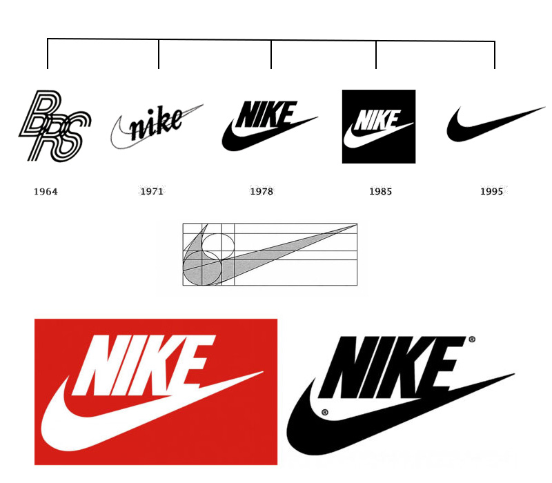
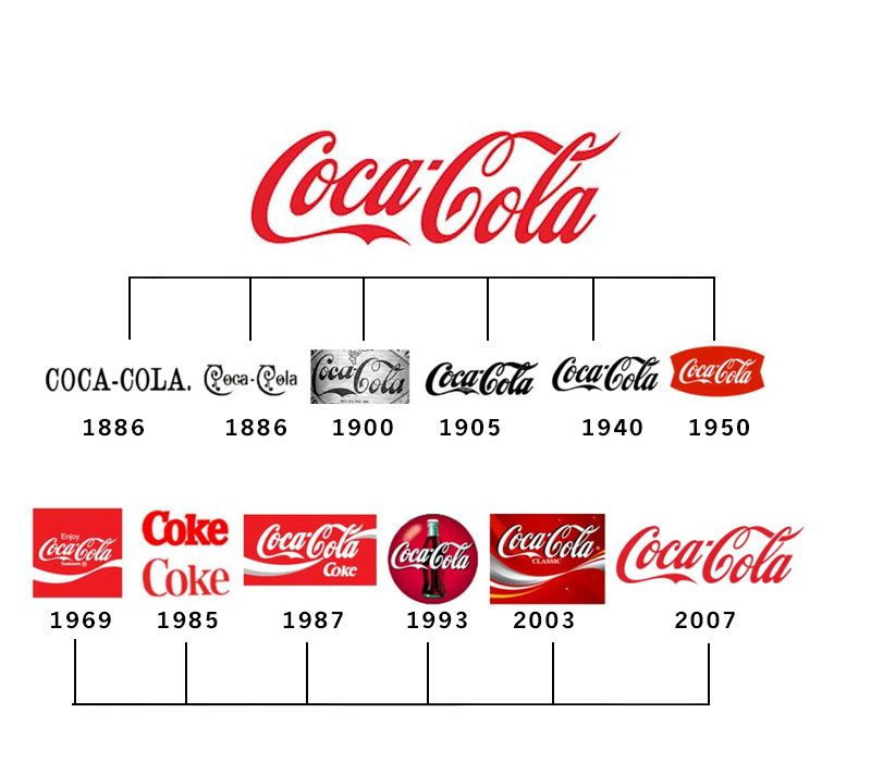
The 20th century saw the rise of corporate logos as we know them today, with iconic examples such as the Coca-Cola logo (1886) and the Nike swoosh (1971).

Digital Era:
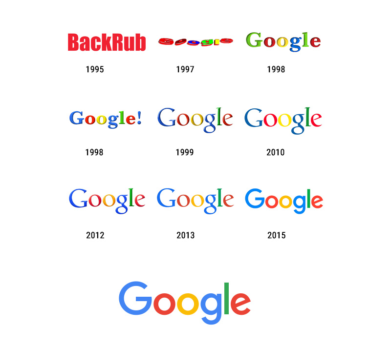
In the digital age, logos have become even more prominent as visual symbols of brands, with companies like Apple (1976) and Google (1998) using logos that have become instantly recognizable worldwide.


If you're interested in reading about Worlds Top 10 Logo Designs and their logo theme secrets, feel free to read on below >>

Logo Maker Pune, Logo designer Pune, Logo Design Company Pune, Logo Design Pune, Logo Artist Pune


Apple Logo Design History & Case Study


The Apple logo, which features a bitten apple, is one of the most recognized logos in the World. It was designed by Rob Janoff in 1977 and has since become a symbol of innovation, simplicity, and creativity. 


The logo has changed over time but has always been simple and clean. 


The current logo features an apple with a bite taken from it, rendered in monochromatic shades of gray or silver. The monochromatic color palette is versatile and timeless, making the logo appear clear and concise at various sizes and resolutions.


From a designer's perspective, the Apple logo incorporates several fundamental design principles and theories. One of the most notable is symbolism, where the apple represents knowledge, innovation, and creativity.


The bite taken out of the apple references the biblical story of Adam and Eve, where they ate from the Tree of Knowledge and gained new insights into the World around them.


One exciting aspect of the Apple logo is that it has evolved, with several iterations and updates, since its initial introduction in 1977. 


These updates have included changes to the color palette, typography, and overall design, with each iteration reflecting the brand's changing priorities and evolving design trends. 


Despite these changes, however, the core principles of simplicity, symbolism, and brand recognition have remained consistent, helping the Apple logo to maintain its iconic status and appeal to a global audience.


Logo Maker Pune, Logo designer Pune, Logo Design Company Pune, Logo Design Pune, Logo Artist Pune

Nike Logo Design History & Case Study

It was created in 1971 by graphic designer Carolyn Davidson for just $35. The simplicity of the Swoosh is now synonymous with the Nike brand and has become one of the most recognizable logos in the World.


The Nike logo is a simple and iconic "swoosh," a simple and elegant design that resembles a curved checkmark; it also represents the wings of the Greek goddess Nike.


From a designer's perspective, the Nike logo incorporates several fundamental design principles and theories. One of the most notable is the use of symbolism. For example, the swoosh represents movement, speed, and athleticism.


One interesting aspect of the Nike logo is that it has remained relatively unchanged since its introduction in 1971.


While there have been some minor updates to the typography and color palette, the core design elements of the swoosh and the brand name have remained consistent, helping the Nike logo to maintain its iconic status and appeal to a global audience.

Logo Maker Pune, Logo designer Pune, Logo Design Company Pune, Logo Design Pune, Logo Artist Pune

Coca-Cola Logo Design History & Case Study

The Coca-Cola logo was created by Pemberton's bookkeeper, Frank Mason Robinson, in 1887. The logo has undergone many changes over the years, but the signature cursive lettering has remained the same.


The iconic script font and the red and white color scheme have become synonymous with the Coca-Cola brand and have helped the company become one of the most successful beverage companies in the World. From a designer's perspective, the Coca-Cola logo incorporates several key design principles and theories.


One of the most notable is typography, where the flowing script letters convey a sense of elegance, nostalgia, and brand recognition. In addition, the typography is highly distinctive, with unique curves and loops instantly recognizable to consumers worldwide.


Another design theory in the Coca-Cola logo is the use of color psychology, where the red and white color scheme creates a sense of energy, excitement, and refreshment.


Red is associated with passion, excitement, and emotion, while white is associated with purity, simplicity, and clarity. Together, they create a powerful visual identity that is easily identifiable and highly memorable.

Logo Maker Pune, Logo designer Pune, Logo Design Company Pune, Logo Design Pune, Logo Artist Pune

McDonald Logo Design History & Case Study

The McDonald's logo, featuring the golden arches, was created in 1961 by Jim Schindler.


The current logo features two golden arches, one placed on top of the other, with the word "McDonald's" written in bold letters beneath it. The logo has undergone several iterations over the years, but the golden arches remain a constant brand symbol.


The logo has since become synonymous with fast food and has helped McDonald's become one of the most successful restaurant chains in the World. From a designer's perspective, the McDonald's logo incorporates several fundamental design principles and theories.


One interesting aspect of the McDonald's logo is that it has evolved, with several iterations and updates since its initial introduction in 1953. These updates have included typography, color palette, and overall design changes, with each iteration reflecting the brand's changing priorities and evolving design trends.


One of the most notable is simplicity, with a clean and minimalistic design that is easily recognizable and highly memorable. In addition, the golden arches are a versatile and timeless design element, allowing the logo to appear clear and concise in various sizes and resolutions.

Logo Maker Pune, Logo designer Pune, Logo Design Company Pune, Logo Design Pune, Logo Artist Pune

Google Logo Design History & Case Study

The Google logo was created by two co-founders of Google, Larry Page and Sergey Brin, in 1998. However, the original logo was designed by Ruth Kedar, a graphic designer based in California, in 1999. She was hired by Page and Brin to create a new logo that would reflect the company's brand and values. Kedar's design used primary colors and a playful font to convey the brand's friendly and approachable nature.


Over the years, the Google logo has undergone several updates and changes, but it has retained its distinctive, playful style that reflects the company's culture and values. The Google logo is a modern and iconic design synonymous with the brand's focus on innovation, simplicity, and accessibility.


From a designer's perspective, the Google logo incorporates several key design principles and theories. One of the most notable is the use of color psychology, where each letter is colored in a different primary color (red, blue, green, and yellow) to evoke a sense of vibrancy, energy, and playfulness.


Another design theory in the Google logo is negative space, which is evident in the subtle white space between the letters. This technique creates a sense of balance and legibility, allowing the logo to appear clear and concise at various sizes and resolutions.


Finally, the Google logo also incorporates simplicity, with a clean and minimalistic design that reflects the brand's focus on innovation and ease of use. In addition, the custom sans-serif font is easily read and instantly recognizable, even in small sizes or low-resolution contexts.

Logo Maker Pune, Logo designer Pune, Logo Design Company Pune, Logo Design Pune, Logo Artist Pune

Amazon Logo Design History & Case Study


The Amazon logo, which features an arrow pointing from the A to the Z, was designed by Turner Duckworth in 2000.


The logo has since become a symbol of the company's commitment to providing a vast range of products and services and has helped Amazon become one of the most successful online retailers in the World.


From a designer's perspective, the Amazon logo incorporates several key design principles and theories. One of the most notable is the use of negative space, where the arrow is used to create a subtle smile shape between the letters "A" and "Z" ; symbolizing the company's extensive range of products and services.


Another design theory present in the Amazon logo is the use of color psychology, where the letters are colored in a shade of orange that represents warmth, energy, and optimism.


Finally, the Amazon logo also incorporates simplicity, with a clean and minimalistic design that reflects the brand's focus on ease of use and accessibility.

Logo Maker Pune, Logo designer Pune, Logo Design Company Pune, Logo Design Pune, Logo Artist Pune

FedEx Logo Design History & Case Study


The FedEx logo, which features a hidden arrow in the negative space between the E and the X, was designed by Lindon Leader in 1994. The FedEx logo is a modern, minimalist design incorporating several key design principles and theories.


The clever use of negative space in the logo has won numerous awards and helped FedEx become one of the World's most successful package delivery companies.


From a designer's perspective, the FedEx logo is an excellent example of negative space, where the hidden arrow between the letters "E" and "x" creates a sense of movement and direction. This design element is subtle yet effective, allowing the logo to convey a sense of speed, efficiency, and precision.


Together, they create a powerful visual identity that is easily identifiable and highly memorable.

Logo Maker Pune, Logo designer Pune, Logo Design Company Pune, Logo Design Pune, Logo Artist Pune

BMW Logo Design History & Case Study


The BMW logo, a blue and white spinning propeller, was designed in 1917 to represent the company's origins as an aircraft engine manufacturer. The logo has since become a symbol of precision engineering and has helped BMW become one of the World's most successful luxury car brands.

From a designer's perspective, the BMW logo is a great example of symbolism and brand recognition.


For example, the blue and white checkerboard pattern in the center of the roundel refers to the company's origins in aviation, where the colors were taken from the Bavarian flag and used to represent the propellers of an airplane. This historical connection adds depth and meaning to the logo, creating a sense of heritage and tradition.


The BMW logo is a symbol of luxury and performance. The sleek and sophisticated BMW logo incorporates several key design principles and theories.

Logo Maker Pune, Logo designer Pune, Logo Design Company Pune, Logo Design Pune, Logo Artist Pune

Pepsi Logo Design History & Case Study


The Pepsi logo was first introduced in 1898 and has undergone many changes over the years, but the current logo, which features a red, white, and blue circle with a wave in the middle, was designed in 2008.


From a designer's perspective, the Pepsi logo is a great example of symbolism and brand recognition. The circular shape of the logo represents a globe, reflecting the brand's global reach and appeal.


The wavy red, white, and blue design evokes a sense of dynamism and energy, reflecting the brand's youthful and lively spirit. Also the use of red, white and blue refers to the American flag and is intended to create a sense of patriotism and national pride. Red is also associated with energy, excitement, and passion, while blue is associated with trust, reliability, and calmness.


Combining these colors creates a balanced and engaging visual identity that resonates with consumers emotionally. The logo has undergone several updates and redesigns since its initial introduction in 1898, with each iteration reflecting the brand's changing priorities and evolving design trends.

Logo Maker Pune, Logo designer Pune, Logo Design Company Pune, Logo Design Pune, Logo Artist Pune

Toyota Logo Design History & Case Study

The Toyota logo is an excellent example of a logo that has evolved. The logo has undergone several iterations, but the overall design and color scheme has remained consistent. 


The Toyota logo is a simple and recognizable design incorporating several key design principles and theories. It features an oval shape with three overlapping ellipses, forming two perpendicular ellipses inside the outer oval, with the word "Toyota" written in a clean, sans-serif font.


From a designer's perspective, the Toyota logo is a great example of symbolism and brand recognition. The three overlapping ellipses represent three hearts:

  • The heart of the customer

  • The heart of the product

  • The heart of progress in the field of technology 


Another design theory in the Toyota logo is negative space, where the overlapping ellipses create a sense of depth and movement within the design. This creates a dynamic and engaging visual identity that is easily recognizable and highly memorable.

Contact Sushant & Vijaya

For those seeking a world-class logo design and branding expert, Sushant is the obvious choice. With a proven track record of success and a deep understanding of the art and science of logo design, he is truly in a class of his own.


Email:
info@logo-company.in, imediainfotech@gmail.com
Mobile / Whatsapp: +91 - 73106 39500, 98974 93280
(10:00 am to 6:00 pm India Time)

View Logo Design Gallery >>